 Painting flowers is well within my comfort zone, and I wanted to do a blossom in an unusual way, since I had it pegged as a show entry. My huge red garden poppies provide endless interest and I’ve taken oodles of photos. The delicate petals are beautiful and frilly. They catch the bright sunlight in a dramatic fashion, reaching out and up like dancing ballerinas.
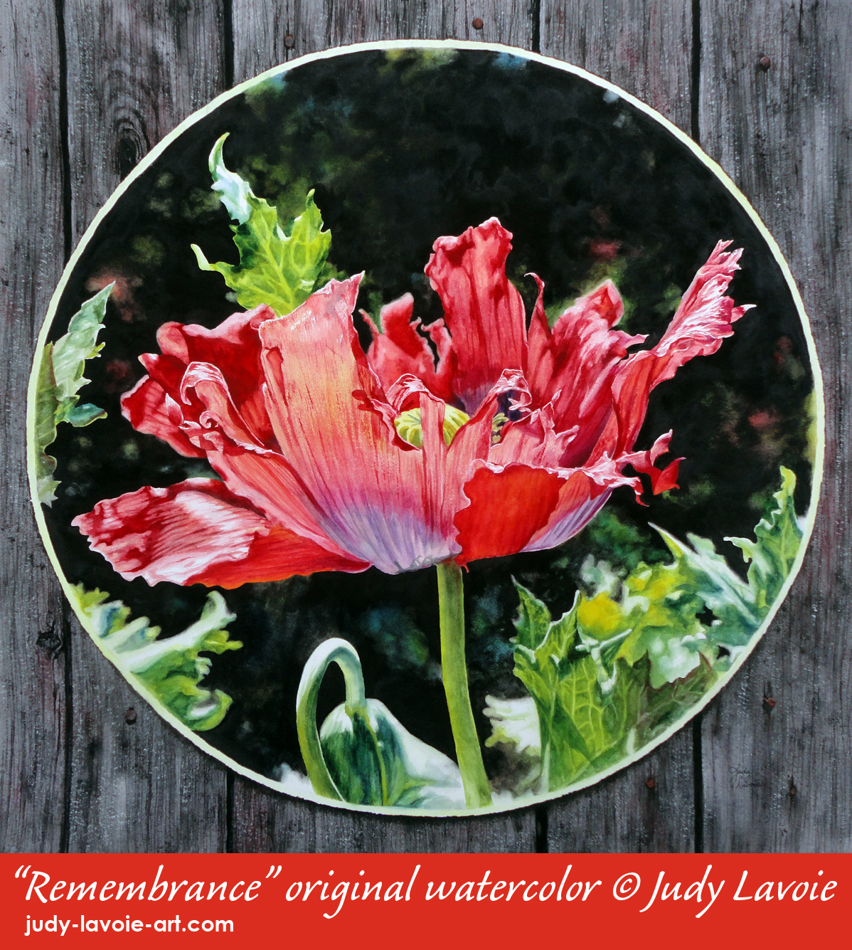
I had done another big poppy painting a couple of years ago, painting with acrylics on a horizontal canvas, “Sunny Side Up.” My new painting, “Remembrance,” is painted with transparent watercolors on paper; this is the first time I’ve painted the same subject in two mediums and on different surfaces. In addition, I borrowed the circular format from another watercolor I did many years ago, “Nature Paints A Picture,” a branch of a flowering dogwood tree within a circle with a background suggesting a rusty surface. The circle is painted to look like a piece of watercolor paper fastened onto the background surface. Both of these earlier paintings were award-winners, and the wonderful people who purchased them continue to express their love for the artworks, so I figured it was safe to reinvent the wheel.
I began by cutting a “double elephant” sheet of 300lb. cold press Arches watercolor paper into a 29.5″ square. The collage of in-process photos shows how I used blue masking tape to define and protect the edge of the outer circle. I actually tore small strips of the masking tape lengthwise and positioned the rough edge on the inner edge of the circle to look like deckle-edged watercolor paper. I pencilled in another circle within the masking tape which I planned to paint only with the first light coat of yellow, leaving a 3/8″ border around the flower image. I then applied masking fluid to preserve the white parts of my flower and foliage. On a flower, the masked areas don’t need to be precise and exact, as they might on a painting of a building, and I find it easy to apply the masking liquid with the end of a paint brush handle which is beveled. I built up the center image slowly, glazing layer upon layer of thin transparent color. I was striving to depict the transparency of light through the petals, particularly with the backlighting on the closer petals. The flower had areas of both warm red tones and cool pink hues. I love the purple base of these poppies and how Mother Nature transitions purples into the red areas. Masking the white areas makes it easier to paint glazes without carefully leaving unpainted sections (whites in traditional watercolor techniques are not created with white paint, they are the unpainted white of the paper.) See the difference when the masking is removed, between Steps 5 and 6.
I aimed to create a soft out-of-focus background. The sun is high above and my poppy is blooming where there are shade trees and dappled light beyond. As Step 6 shows, I randomly painted areas of blue, yellow, green and red tones throughout the sections behind the flower and leaves. Once that dried, I mixed a black from other colors and slowly proceeded to paint small sections at a time, allowing areas of the base colors to randomly appear. A black watercolor mix vs. black straight from a tube is my preference. Even though it is very dark, it is somewhat transparent, so I think the undercoating of other colors adds more richness. I blended the paints, sometimes using stencil brushes as sold for crafts, with repeated pouncing of the wet paint where colors meet. You can see the dramatic change from Step 6 to 7, where the darkened background makes the flower and foliage really pop in contrast. I softened the edges of many leaves and petals, creating more dimensionality and variation. I also softened the edges of places which had been covered with masking fluid, since it leaves a sharp white edge, and I also carried some of the surrounded color into some of the white sections. Softening can be achieved by re-wetting the painted edges with clean water and rubbing them with a stiff bristled brush.
I struggled with what to paint outside the circle, considering soft draped fabric in red or purple as well as one of my favorite textures, old barn siding. I didn’t want the outer background to compete for attention with the flower, but I wanted it to be interesting on its own. Barnboard won out; I covered the center circle to protect the completed flower and its yellow outline. I had fun creating the wood texture, adding old rusty nails and knotholes for interest. I like how the neutral tones accent the bright colors of the center circle.
Often I come up with a title before beginning a painting but this was not the case for the poppy. I emailed the final painting image to a handful of my ‘art advisors’ with about 7 possible titles. The winner was overwhelmingly “Remembrance.” Have you ever encountered a veteran’s group handing out red poppies on Veteran’s Day? The holiday is called Poppy Day and Remembrance Day in other countries; the reference to a red poppy symbolizing the memory of fallen soldiers is from a poem called “In Flanders Fields” by John McRae.
Remembrance is one of my two entries into the 2020 Tennessee Watercolor Society Biennial Exhibition. I’ve just completed my second entry, which I will post here soon, and submitted to the show. Each member can submit two paintings but no more than one can be included. The juror’s choices will be announced in June. We’ll hope that the changes brought to our lives from the coronavirus pandemic will not be long lasting and that the show will go on as planned in August.
P.S. Giclee prints are available for “Remembrance.”