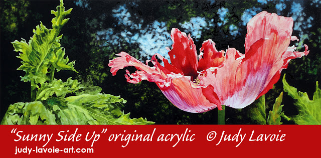
For my newest painting I had two goals in mind: (1) to use acrylic paints in a highly transparent way, and (2) to use an odd shaped canvas I’ve had among my art supplies for too long. The canvas is three feet wide and a little over a foot tall, so I decided to use it horizontally and create a painting of a big backlit red poppy from my garden.
To begin, I reviewed many poppy reference photos in my file and chose a single flower with its delicate frilly petals outstretched in the sunlight. The image included a lovely blend from reds to purples that make this poppy variety so striking, as well as a tiny peek at the central yellow stamens and their shadows at the base of the flower.
For my composition, I positioned the flower off-center, and added poppy leaves from other photos with similar lighting. The bigger group of leaf shapes on the left provide balance, and work with leaves on the right to frame and point toward the poppy flower, my obvious focal point. The background would be mostly black, but with out-of-focus areas of distant greenery and blue sky, mostly around the flower for additional emphasis.

After drawing my design in pencil on the white canvas I could tell my pencil lines were too dark, knowing I wanted to apply the acrylic paints very transparently. So I painted the entire canvas with a thin layer of gesso, enough to better conceal but not hide my guidelines.
Just as with watercolor pigments, there are different levels of opacity with acrylic paints. I use Golden Fluid Acrylics and routinely mix them with Golden Acrylic Glazing Liquid in addition to thinning with water. This probably stems from my love of watercolor painting and my preference for working with thin layers of color and glazing one color over another. But this time I really wanted to push the transparency of the medium.
This painting progressed from the left side to the right, and I honestly can’t explain why! Once the left leaves were painted I was anxious to see if my plan for dramatic backlighting was going to work, so I painted opaque black around the leaves. Viola, seemed it was going in the right direction! In the photo collage you can also see how I blocked in areas of Cerulean Blue Chromium lightened with white gesso above the flower, then later softened these blue and leafy green areas into small out-of-focus splotches within the black background. I often use small stencil brushes to create the soft edges, pouncing them on the canvas.
The flower itself was a joy to paint. Even though this is a bold red poppy, the sunlight through the petals greatly lightened their hues. The main red paint used was Napthol Red Light, which tends to be opaque. I thinned it with just a little water for the darkest red areas. In the lighter parts of the petals I mixed the red with some Quinacridone Red (leans toward cool pink) and Nickel Azo Yellow which are naturally very transparent, and used the glazing liquid too. The purple on the lower part of the flower is Permanent Violet Dark, applied very thinly. Pure white on the tips of the petals, which are unpainted areas of the white canvas, intensify the effect of the midday sun.
Once I had reached the right edge of the painting I felt that the leaves were in too much competition for attention with the flower. I liked the leaf highlights, but I thought I needed to make the leaves less contrasty. So I used my transparent greens over the leaf shapes, preserving just a few little white highlights. I glazed the sky blue over some parts of the leaves also, since a cool blue pushes an object back visually. I also used less diluted sap green with black to make some of the leaf edges disappear into the background (creating “lost edges” as they are called in art circles). Oops, along the way I made the stem of the poppy too dark, so I lightened it up again to anchor the flower down. I toyed with fiddling around more, perhaps darkening the leaves, but decided to declare “Sunny Side Up” finished.
One of the most-asked questions I get about my art is “How long did it take you to do that painting?” Since painting is my pleasure time, I don’t want to punch a time clock and track my hours – I’d be scared to, since the price on an original painting would calculate to a pitiful hourly wage! For this painting, however, I can give a rough idea of the elapsed time. Not counting the time I spent creating the composition and transfering the drawing to the canvas, I worked on the painting over the course of 9 days. Some days I didn’t go near it, and other days I’d spend between 2 and 6 hours. So that’s the best answer I can give!
