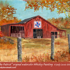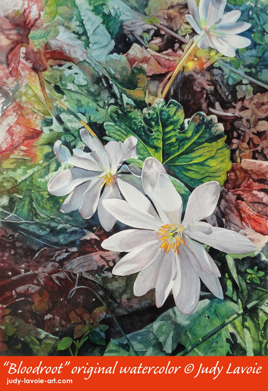
In creating my design, I chose to include three blossoms. When illustrating multiples of the same object, an odd number is more visually interesting than an even number. Also, I positioned the closest and brightest bloom (my focal point) in the lower right quadrant; according to the “golden mean,” the best position for your major element is roughly at any intersection of a grid dividing your paper into thirds vertically and horizontally. The lower right felt a bit unusual for a focal point, but it seemed right for this composition. You can give a painting more interest if one of the elements jumps off the edge of the paper, as I’ve done with the blossom at the top. In my reference photos, I loved the curlicue stem to the left of my main flower, since it looks something like the way I make the “L” in my signature, so that’s been included subtly in my painting.
 In my recent colorful watercolors, I’ve started the paintings with big drops of the three primary colors, spattered from fat brushes dipped into cups of diluted paint. For this painting, I wanted to apply the three colors more quickly and in a way that I could better control the mixing of the colors. I decided to use plastic squeeze bottles with pointed tips, diluting the colors slightly with water and filling each bottle with about 2″ of fluid. I wanted rich middle values, so I knew I’d be applying a lot of color. Also, the dried masking pushes the wet color off as it repels it, so there’s a lot of fluid movement. For this reason, I worked in our basement – I would have worked outdoors, but the weather wasn’t cooperating. I laid a large dropcloth over the concrete floor, set a folding tv table in the center, and placed my painting board on the little table. This way the diluted paint that puddled and/or flowed toward the edges could be sopped up with a paper towel, and if some dripped I wouldn’t be making a big mess. It gave me more freedom to concentrate on the directing and mixing of colors. I wanted some bright orange shades, since the Bloodroot sap and cut roots stain in that color; I also wanted the darkest colors to be around the main bloom, so I guided the red and blue there. I painted the big leaf above the main bloom with blue and bright yellow and shades of green. Using the plastic bottles worked out well, allowing me to get the paper covered with color and mixed with my fingers before the paint started to dry.
When the painted paper was totally dry, not even cold to the touch, I removed the masking. I loved how the bright whites looked against the vivid colors! Even though I preserved whites among the background leaves, those areas would be glazed over with light shades of color, so not to compete with the brightest whites in the flowers. I figured the flowers themselves were the best place to start brushing on paint; lighting from behind created many shadows which defined the petals and how they overlapped. Getting those shadow tones started would help me determine how dark the background should be in contrast. I also painted the colorful yellow/red centers of the flowers, then I moved around the background one area at a time, adding color in medium to dark values in order to define shapes of leaves, stems, and little foliage plants. In each area, I used values of the same hue that came from the initial underpainting – for example, under the main bloom I painted the leaf and stem shapes with yellow and blue, allowing mixed greens. The masking creates sharp edges and often dark outlines of color around the light areas, so I used paint and water to soften many areas. It was a slow, detailed process, but I could see the effect I wanted beginning to come together and I enjoyed creating it.
In my final painting steps, I did additional glazes of very dilute blues and purples on the petal shadows to unify them, and I added some of dark values throughout the painting to add depth and dimensionality. I still felt the background was stealing attention from the blossoms, so I filled a spray bottle with some diluted blue paint and lightly applied a mist of blue over some of the background, laying paper over the flowers to keep the spray from landing on them. This helped to push those areas back visually. Finally I had achieved the effect I was aiming for! I declared “Bloodroot” finished and, happily, sent a digital image of it as an entry into an upcoming watercolor exhibition (along with “Eat Chicken”), barely ahead of the deadline. I’ll hear in early April whether either is accepted – while the bloodroot are blooming in my forest!