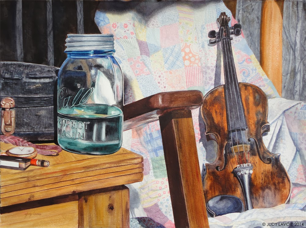
I’m a bit of a nostalgia buff, with antiques around the house, framed old family photos, and a collection of handmade laces. So this newest painting began with my desire to create and preserve a moment in time, from days past.
The central character of my story is missing – the imaginary “grandfather.” I wanted the scene to suggest that he just got up from his favorite chair, nestled by the cozy old quilt, and is taking a break from one of his favorite relaxing activities, fiddle playing. He is indulging in his pleasures, with little regard for what time it is, and enjoying a sip of moonshine from the old mason jar.
I gathered items for this still life from various sources: Rick bought me the old fiddle and its worn case from our friend Charles years ago to encourage my desire to learn to play; the quilt is a family heirloom of my friend Sandy; the pocket watch with a braided leather strap was given to us by a hardworking old man named Floyd who helped us clear away trees from our home site and taught me how to identify many of the hardwoods in our forest. Floyd became our friend and said the watch had belonged to his dad. The Ball canning jar is my antique find that was used to hold a bunch of flowers in my last painting “Barnyard Bouquet,” this time shown with a tin lid, and looking like the traditional jar of ‘shine. I set everything up on my porch, with the old handmade chest we use as a coffee table and one of our many porch rockers. The sun was bright and I took photos from different angles before settling on my favorite. I liked a view of the scene with the eye-level low, as if seen by a young grandchild.
I’m motivated to paint with watercolors again now because another Tennessee Watercolor Society biennial exhibition is coming up. Two entries are allowed, and the entry data is due in early April, so this is one of two I plan to enter. I love working with watercolors, but the matting and framing under glass required for artwork on paper is extra work and expense, so I primarily paint with acrylics these days.
As I’ve done with past watercolors, like “Jerry Van, Music Man“, and “Jesus Saves”, I painted this with a limited palette. This is based on the color theory that the three “primary” colors – red, blue, and yellow – can be mixed to make all other colors. The theory is valid, however, since paint pigments are not “pure” colors, you cannot really mix all other colors. Some reds lean toward orange, some toward purple, and likewise with the other primaries. A bluish red mixed with a greenish blue won’t make a nice pure purple – in fact, the resulting color would likely be a brown or grey. Also, in the color theory, black and white need to be added to make dark and light shades (although there is no white paint in traditional transparent watercolor – the white is your unpainted paper). But if you choose the colors of your limited palette carefully, some great results can occur.
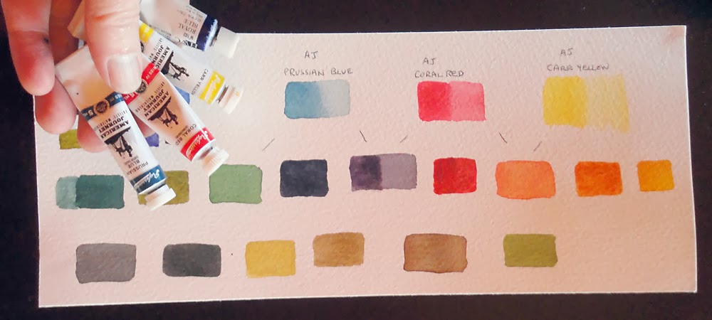
It’s challenging to mix all the colors in a painting from just a few, but it’s a technique which helps to unify the overall appearance of a painting. When I notified my art supplier, Cheap Joe’s Art Stuff, about my use of a limited palette of their paints for my painting Jerry Van, Music Man, they shipped me three different primary colors of their house-brand American Journey Watercolors: Prussian Blue, Coral Red, and Carr Yellow, and challenged me to try them. I had never used the latter two colors before, but I was intrigued with the possibility of doing a painting with just these colors. I was a little concerned about Prussian Blue being a little light and greenish, knowing the still life would need some rich dark tones, so I added a 4th color to my palette, Holbein Royal Blue. Before beginning the painting, I made myself a color chart, seeing how these 4 colors would mix to form the secondary colors of orange, green, and purple. I knew I’d be needing many shades of brown and some rich deep black tones, so I tested to be sure I’d be able to mix these also. It seemed these colors would work, so I decided to use them. My final concern was that these were very tiny tubes of paint, and I hoped I wouldn’t run out of any one of them before the painting was finished!
There are often unexpected results in a watercolor painting, even with a control-freak like me, and I find it challenging to process them. I painted the various fabric squares of the quilt first – and had great fun with all the patterns and colors. But, oops… I stepped back when I had completed this part of the painting and the quilt was screaming at me – too bold, too sharp and too bright. I had wanted it to be a soft, subtle background, but, left as it was, I thought it would compete for attention with the items I wanted to have more visual importance. So I filled my bucket with clean water, got out the 2″ wide brush and some paper towel, and did wet-blot-wet-blot to remove lots of the pigment. Watercolors vary in their tendency to just sit as a sediment on the surface of the paper or to be absorbed into the fibers. Those which are sedimentary wash away very easily. Fortunately, the paints I had used had good staining ability, so I could somewhat control how much color got removed. Viola! A soft, faded and muted background, much like the quilt would look after years of use and washings, appeared. The slightly bumpy texture of my “cold press” heavy 300 lb. watercolor paper also added to the textured look of quilted fabric. Looked like this would work.
This was a fairly complex painting and I only paint for a few hours at a time, then I might not get back to it for a week or more. So I tackled one element in each sitting – working on the coffee table one time, the mason jar in another painting session. The limited palette helps when working this way; if I used a color that hasn’t been used elsewhere in one section of the painting, it could look out of place and disconnected.
This painting’s title is a play on words. A “fiddle break” among bluegrass musicians is when the fiddle is featured taking the lead, usually playing the melody while the other instruments accent it. In my painting, I imagine that grandpa is taking a ” fiddle break” for a sip of his home brew.
Picasso’s “Blue Period” lasted four years, but my “mason jar period” of my recent two paintings is going to be over faster than that! I’m not sure what topic to choose for my next watercolor, but it will not have the blue jar, I guarantee.