 |
| “Sleeping Ginger,” painted in black ink on scratchboard |
The point of view you choose for a painting can make a big difference. For example, I always try to depict portraits of dogs with my eye level pretty much at the dog’s eye level. “Sleeping Ginger” really illustrates this – if I was standing above Ginger, looking down at her on the floor, the intimacy would have been lost.
In painting an outdoor scene, the point of view is critical, certainly for the lighting of the main subject, but also for guiding the eye of the viewer, making it travel into the painting toward the main subject. You can pull the observer into a landscape painting by using natural perspective lines which converge as they move further away: a fenceline running away from the viewer, a road getting narrower as it travels back from the foreground, a river flowing into the distance. You can use tree branches or the arrangement of buildings to create a visual tunnel, through which your subject is revealed.
 |
| Not so interesting |
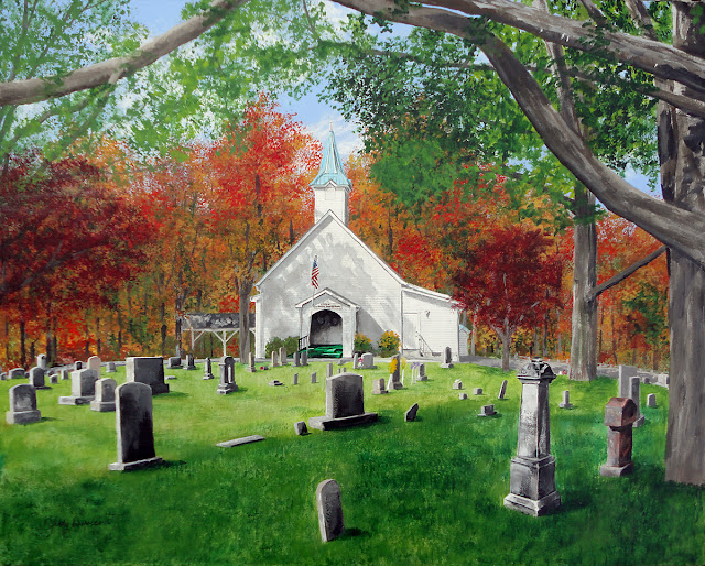
My newest painting, a commission for my friend and great patron Mitch, is the Citico Missionary Baptist Church. It’s a lovely white clapboarded country church, with a light blue roof and steeple. Many of Mitch’s ancestors are buried in the cemetery which covers the hillside in front of the church. I took lots of reference photos during my visit to the churchyard, as the sun went in and out of the scattered clouds above. I walked back and forth through the grave yard, photographing the church from different angles. As I moved, I was observing the lighting, the shadows, and the arrangment of the various elements in the scene. I was composing the painting itself, juggling the various elements to make it interesting and to help emphasize the church as the main subject.
 |
| The grave stones lead the eye inward |
In choosing the best point of view for the painting, I noticed I could utilize the perspective of the rows of grave stones, leading the viewer’s eye back – as the monuments got further away and smaller – to my main subject, the church. I could see this best when I stood a bit to the right of the church. Then I noticed that from this vantage point, if I moved back a bit, the trees would anchor the right and left edges of my painting, with branches across the top framing the church.
 |
| Pulling back really helped frame the scene |
Once back in my studio, I really liked the final reference photo for other reasons… the foreground cedar tree was shading some of the grass, and the shadows added additional variety and interest to the foreground without being too busy; the evergreen branches of the cedar would also offer nice contrast with the autumn colors I planned to use in the other trees. But two things needed fixin’ – I liked having the white church in brighter lighting as it was in some of my other photos, with dramatic cast shadows; it appeared flat and not so interesting in this final reference photo. Also, Mitch had pointed out one particularly notable ancester, whose monument was tall and interesting – but it wasn’t in view from this angle. So, with Mitch’s permission, I used “artistic license” and moved the grave! I position it so it balanced with all the other elements, and so its perspective and lighting fit logically with the rest of the scene, in the lower right corner. Voila, my vision was complete – now I just needed to begin painting it!
Here is the final result, my newest painting “Citico Chuch”.
