One of the most important design elements in a painting is value. Value (or tone) can be defined as how light or dark a color appears, rather than its actual color (“hue” or “chrome.”) Think of a black and white photograph, where the image is composed of blacks and whites, plus a full range of grey values. The same is true of a drawing in pencil or charcoal, as with my drawing of my cat Ernie. Turn any color image into black and white or into a monotone – any one color with a range of values – and you can see the values more clearly.
Just as white blends to black with many tones of grey in between, you can create a range of values from white to any color. Using transparent watercolor is a bit different, where water is added to a color to make it lighter, relying on the white of the paper to show through the transparent coating of pigment. With oils and acrylics, a light color is sometimes used in place of white to create a lighter value, such as adding a little yellow to a dark blue.

Successful representational paintings have a range of values. For the artist, values are a tool to help to define forms and create the illusion of space. A ball will have the lightest values where the most light hits it; a gradation of light to dark values will define its round shape, and the edge furthest from the light source will be the darkest value… no matter what color the ball is. Values should be used to emphasize the focal point of the painting; I learned in a workshop that the darkest darks and brightest lights in a painting should be reserved for your main subject.
 Colors which are naturally light, like yellow, will have a smaller range of hues than a dark color like black. Also, how light or dark a tone appears depends on the other tones near it. If your overall painting is light, a mid-tone might be dark enough for your effect, rather than a very dark tone which might be too stark.
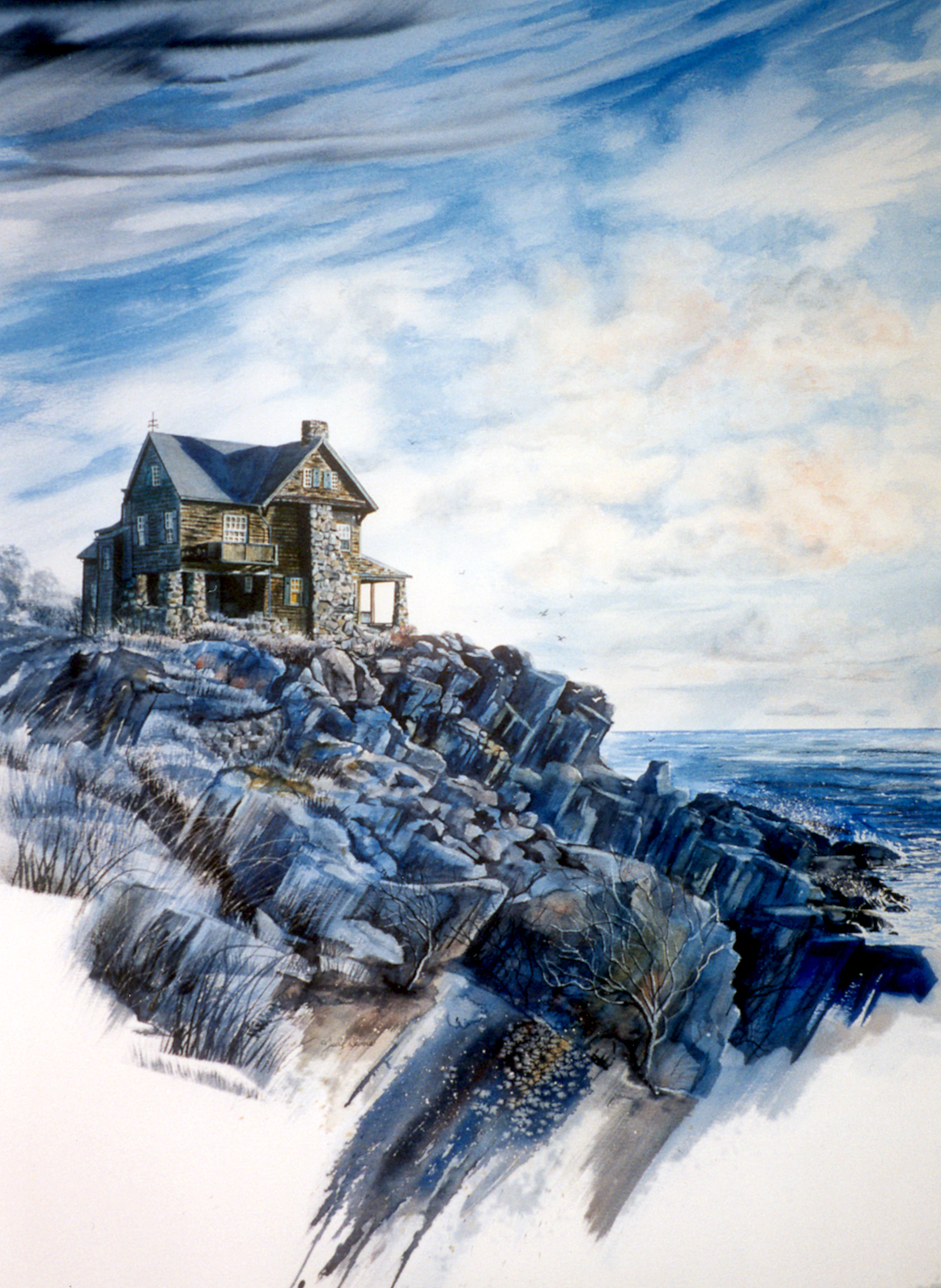
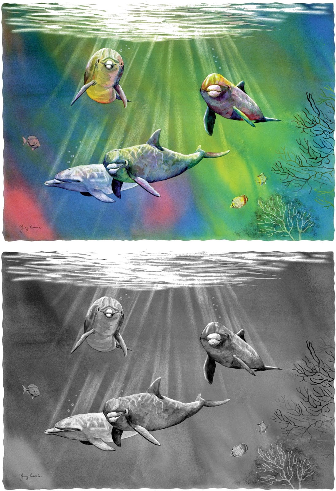
I use values in many ways in my paintings. “Let It Snow,” a barnyard scene I painted in acrylics, is primarily painted in whites, blacks and greys, which is how the weather dulls a scene when overcast and snowy. Any really bright colors would have clashed in this landscape. The house on the Maine coast in “Solitude” is painted in watercolor with just two colors, so it heavily depends on blue and brown values to define the scene. The white of the watercolor paper shows through where the paints were most diluted, as in the sky. One of my many dolphin paintings, “The Color of the Waves,” uses a rainbow of unrealistic colors, but the scene looks natural because I concentrated on getting the values right… as shown in the greyscale version of the painting which I created in Photoshop.
If you are struggling with getting your painting to look right, and can’t figure out exactly way, try doing your next painting just with one color and white. It’s a great exercise which will help you understand the value of values in all your future paintings.
I hope you’ve enjoyed my monthly art postings with focus on different aspects of art. Coming soon – my newest still life painting!