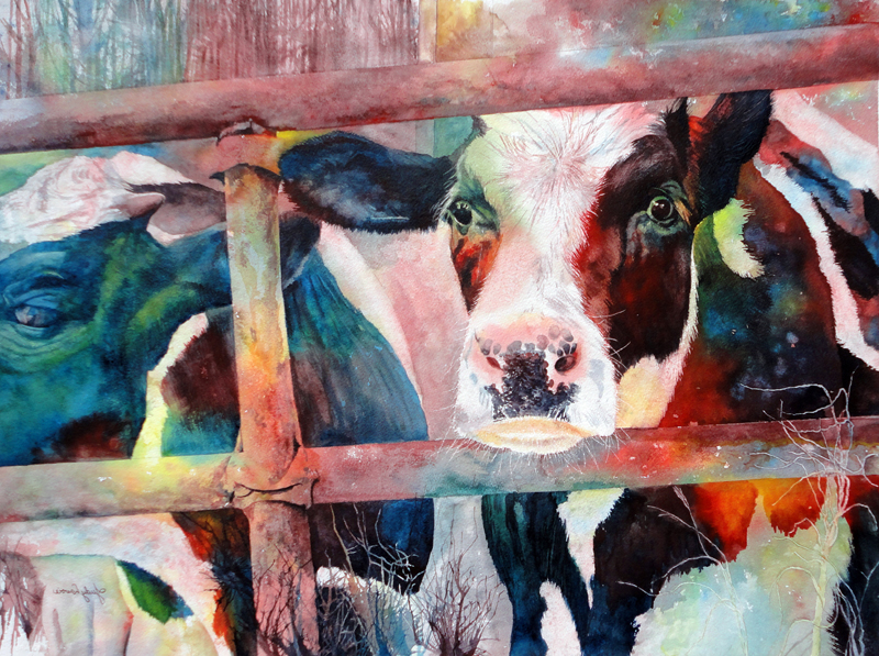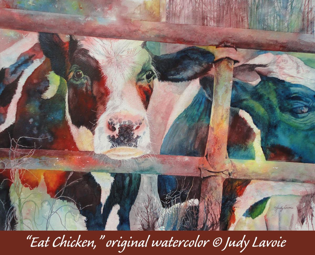
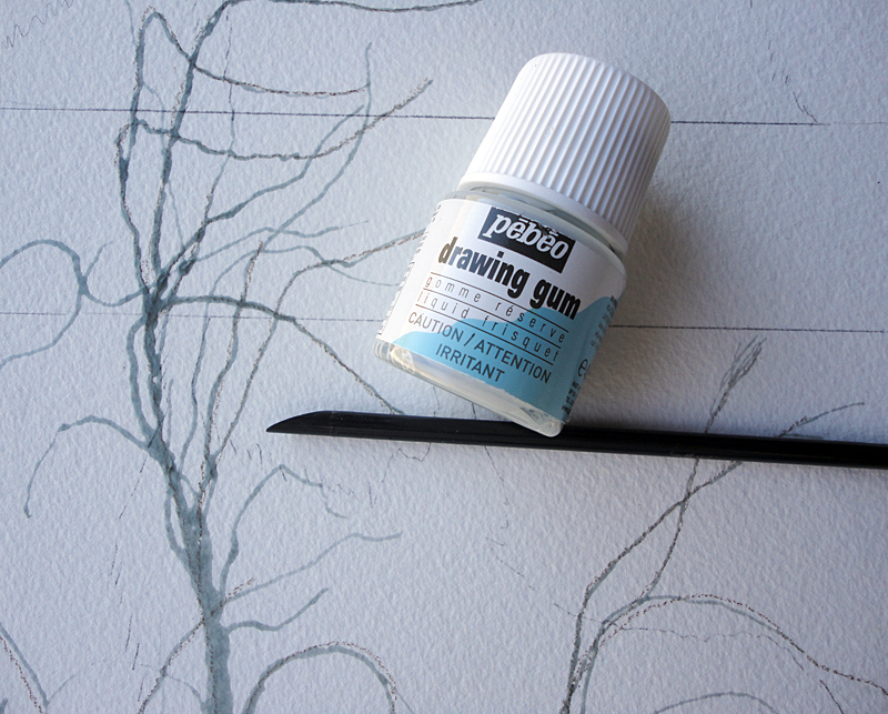
 In the reference photo I selected, I liked the way the farm gate framed the face of the left cow, and I thought the separations it created might make it easier for me to work on sections at a time. My painting time is usually very random, not always for long sittings, so the natural divisions would help me make a cohesive overall appearance. Once again I decided to paint in watercolors on my favorite heavy (300lb) textured (cold press) paper. This time, my palette of primary colors included Winsor & Newton paints: Antwerp Blue, Winsor Red, and Winsor Yellow. My goal was to make the painting very colorful, allowing the colors to mix on the paper. Since the subject was basically black and white, the values I painted would define the images. I used just a little bit of masking fluid, applying strokes of grasses in the bottom right corner with a brand of masking fluid I find works well, Pebeo Drawing Gum. Masking fluid can ruin a paint brush, and I found it easy to guide the fluid in these long narrow strands by dipping the angled back end of a paint brush handle into the mask and dragging that onto the paper.
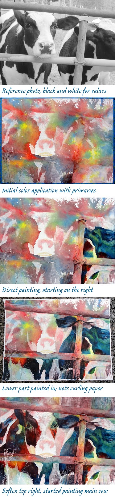
Even though my paper is heavy weight, when applying a wet first coat of paint I find it helpful to fasten the sheet to a stable board, in this case a 1/2″ thick piece of gator foam. This helps to keep the paper from buckling unevenly and it keeps paint from seeping underneath the paper if it runs off the edges. I put masking tape on the edges, pressing down to keep the paint from seeping beneath. My first application of the paints was done by dribbling each of the 3 primaries on the paper, squirting on some clear water, and directing the paints with my fingers to mix them. If the paint puddles up or flows into pools on the edges, I carefully let a bit of paper towel sop it up; puddles which dry slowly tend to flow back into drier areas, potentially creating unwanted “blooms”. The masking tape on the edges helps avoid these effects. After the underpainting dried, I removed the paper from the support board, which left a narrow unpainted white border around the image, as you can see in the photo.
This method of applying the initial paint is a technique I am enjoying. Years ago, I did a lot of watercolor “pouring” – a process which also uses just primary colors and createsunique effects from the random mingling of the pigments. In this techique I’m using of spattering blobs of each color and guiding the mixing with my fingers, I find gives me a bit more control; I can drop more yellow and red paints where I want bright, warm areas, and direct more red-blue mixtures places I want cooler, darker tones. The pouring method I previously used also required continuous steps of masking, pouring, drying, masking, pouring, drying. I prefer this alternate way of getting a colorful underpainting, followed with directly brush painting the rest of the painting.
I didn’t want the primary colors to blend too much, since that might make them less vivid. Also, I referred to my photo and tried to keep the white cow fur either clear of color or painted only with light values… sometimes blotting off the paint a bit with a paper towel. As I directed the colors, I tried to keep in mind that the cow on the left was my focal point, so the brightest colors and the most contrast between darks and lights would help define him as such.
 The photos of my progress show how I moved from one section to another. I really liked the way the cow on the right came out; his face was primarily in blue values and the eye blended in subtly. I also liked the randomness of the colors on the steel tubes of the farm gate, requiring minimal additional color to define shadows and texture. I didn’t like the drips of colored paint I had created in the top right to look like trees, so I glazed over with layers of tall tree trunks over that area, in colors matching the initial drips. Once that was dry, I painted that whole area with clear water and encouraged blending and fading, to make it look blurry and draw less attention. I also removed the masking from the grassy strokes and painted some with lighter values of the colors they overlapped. In a few places I wanted to define the steel bars better, separating them from surrounding color. I found that by using my steel ruler, held flush against the painting, I could scrub away paint on the lighter edges and brush in paint in a straight line in the darker areas. I’m perhaps too precise sometimes, but that’s what appeals to me. I tried hard to retain some areas of “soft edges,” where the colors run from one section into another with little defined separation. A good painting is supposed to have hard edges and soft edges!
I tackled the main cow’s face last, concentrating on making his dark eyes show up well in the dark fur, putting light values in the white fur area of his face, and painting the edges of color areas with strokes which resembled fur. Where the fur was thick on his forehead, I had created a bit of a burst of color by blowing the initial light values in every direction. This gave me a foundation for the tufts of hair, and I added brush strokes to emphasize them more. It was fun to paint the spots which defined his snout. As a final step on his face, I used a sharp X-acto knife blade to scratch through the paint and create white whiskers, also scratching strokes in those tufts of fur on the forehead. The focal point can (and should) be the most detailed part of a painting, helping to call attention there.
- Scrubbed away the little swatch of blue-grey in the white fur on the top of the minor cow’s face, to better separate it from the dark fur;
- Added more color to the grass strands in corner, since the light-on-light effect was getting lost;
- Scrubbed out a bit of pigment where the top bar of the gate has come apart from the vertical bar – I liked that detail and I wanted it to read better as a void area, with just distant background showing through