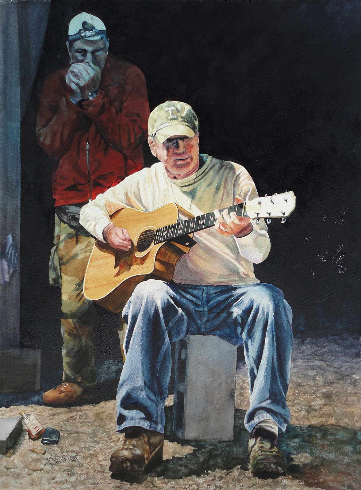
 “Third time’s a charm” was a proverb I hoped would prove true as I decided to capture this scene in watercolor after two previous unsatisfactory attempts. I had taken photos about 4 years ago on an October evening in the mountains with my friends Debra and Mike. When Mike took a seat under the floodlight and started playing his guitar, I snapped a few shots with the intention of giving them to him. Later, when I reviewed the photos, I found the scene was really inspiring for a painting, with the dramatic lighting and high contrast.
Unfortunately, even with my point-and-shoot digital camera which takes great photos in low light, my photos were not perfectly sharp and clear. The camera had not been set on a tripod, and I had used only available light, not a flash. But I could still see the possibility of creating a painting from the scene.
It was actually because of the high contrast that I initially tried a watercolor method I had used successfully years ago, for paintings such as Nana’s Rocker and Ponce’s Lion, which I learned from a demo by Florida artist Jean Grastorf in the 1990s. In fact, Jean was kind enough to include my work as an example in her wonderful instructional book on the subject. The process involves masking light areas of the subject on the watercolor paper to prevent paint from being absorbed, pouring dilutions of the 3 primary colors onto the paper, then moving the puddles around to let the colors blend. By repeating this as each step dries, different values are built up gradually – not in realistic colors but in lovely mixtures of the red, blue, and yellow pigments.
Anyway, the first few pourings on my painting of Mike were going well, as shown in the photo to the left. But in subsequent pourings, my paints began to mix in a “muddy” way – looking dull and brownish. The more I continued, the more unhappy I became. I couldn’t pinpoint whether my problems stemmed from the paints, the paper, or my technique. I don’t often give up on a painting, but I felt this attempt was beyond repair and abandoned it. At one point I showed the unfinished work to Debra, who loved how it depicted Mike and said she would like to buy it, even unfinished, but that idea never sat well with me.
Fast forward to my second try. I was determined to make the pouring method work for this scene, and I started over completely, beginning again with a detailed drawing to identify the value areas. But that was as far as the second attempt went; I never even began to paint. In fact, that pencil drawing is still on the reverse side of this new painting!
Recently I decided to use conventional direct painting vs. pouring and started my painting of Mike one more time. Painting people is outside my comfort zone, but it’s good to stretch oneself, huh? Just to be safe and to get back into the watercolor painting groove, I started on the denim jeans and ivory shirt. As I got braver and more confident, I continued with the guitar, head, and hat, and got Mike pretty close to completion. His features are not detailed and fine, as I painted in Jerry Van, Music Man, since the lighting was sparse and my reference photos were somewhat grainy. But I was satisfied with my progress on the painting and pushed forward.
Next I tackled the second figure, who was standing behind Mike, with his head and torso in the shadows of the barn opening. I painted him with the same brilliance and color saturation as Mike’s figure, knowing I’d eventually have to do some adjusting to tone him down. Then I painted in the foreground gravel, and I really liked the little detail of the liquor bottle on the ground in the lower left. The background was intensely dark, so I made a saucer full of a pigment-rich mixture of my paints and worked quickly with a 2″ flat brush, switching to a smaller brush as I outlined close the figures. Another tip I once heard in a painting workshop is that each corner of a painting should look different from the others, and this painting passed that test. I guess it just makes the painting more interesting…??
 Speaking of brushes, I did this whole painting using just 3 brushes. Two of them are angled, which makes it possible to use the point for fine details and thin lines, or use the whole width of the same brush for more coverage. The smallest brush is a Royal & Langnickel Majestic 1/4″ angular #4160, The middle sized brush is CJAS 3/4″ angle shader from Cheap Joe’s Art Stuff, one of my favorite art suppliers. The widest brush is Miller’s Golden Fleece 2″ nylon flat handled bold wash brush, also one of the house brands from Cheap Joe’s (Joe Miller is the owner/artist).
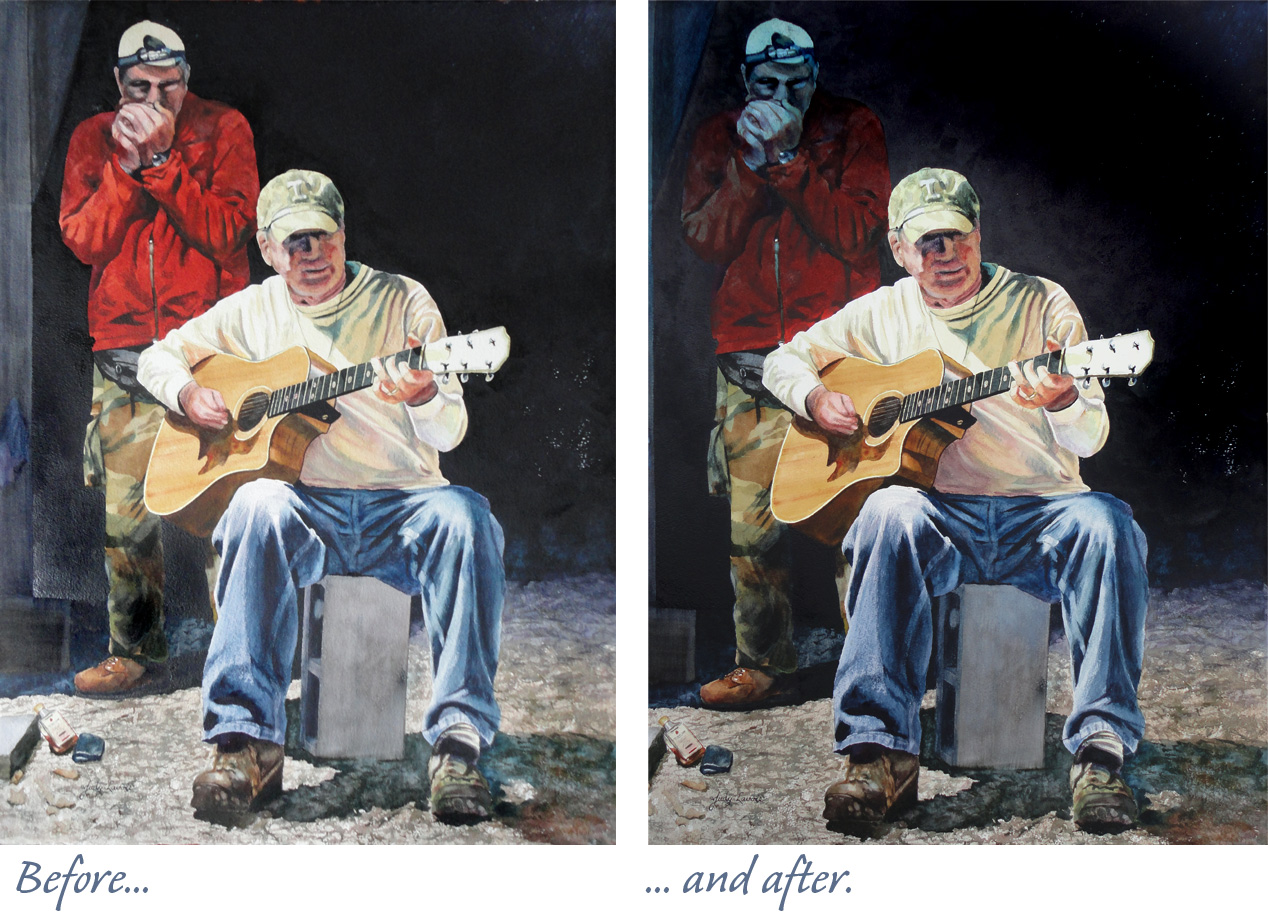
OK, it was time to hold my breath and take a bold move. To “push” the top section of the standing figure into the background, I decided to use one of many techniques I had learned long ago in a workshop from noted watercolor artist Tom Lynch. As in the pouring method, the paint is thinned with lots of water. Then it is used in a fine-mist spray bottle to apply to the painting. Using a cool blue shade tends to make an image recede, so that’s what I used. By spraying a fine mist, instead of painting the color on with a brush, there is less likelihood of disturbing the paint that’s already on the paper (since all the pigments are water-soluble, unlike dried acrylic paints). I hated to mess up the standing figure, and I hoped not to ruin the painting, so I held my breath and sprayed. Better, but not enough. So I let it dry and sprayed again. Voila! He looks a little like a “Blue Man” but I think he looks further back in the shadows. To be honest, I didn’t dare to spray again! I like that this makes Mike’s figure the prominent focus of the painting.
As a last step, I went back around the entire painting, deepening the dark values and adding more contrast. Sometimes I have a hard time deciding when a painting is “done,” and that was the case here. My final test was to show the painting to Mike and Debra. Hoorah, they both love the painting. That makes me happy!