
The first step was designing my painting. Even though my art largely duplicates the scene, I keep basic design principles in focus right from the start – balancing darks and lights, creating a wide range of values from white to black, incorporating interesting angles, leading the eye to a focal point. As my reference photos show, I had different views to choose from. I chose the straight-on view, and cropped the image to what I thought would be most interesting.
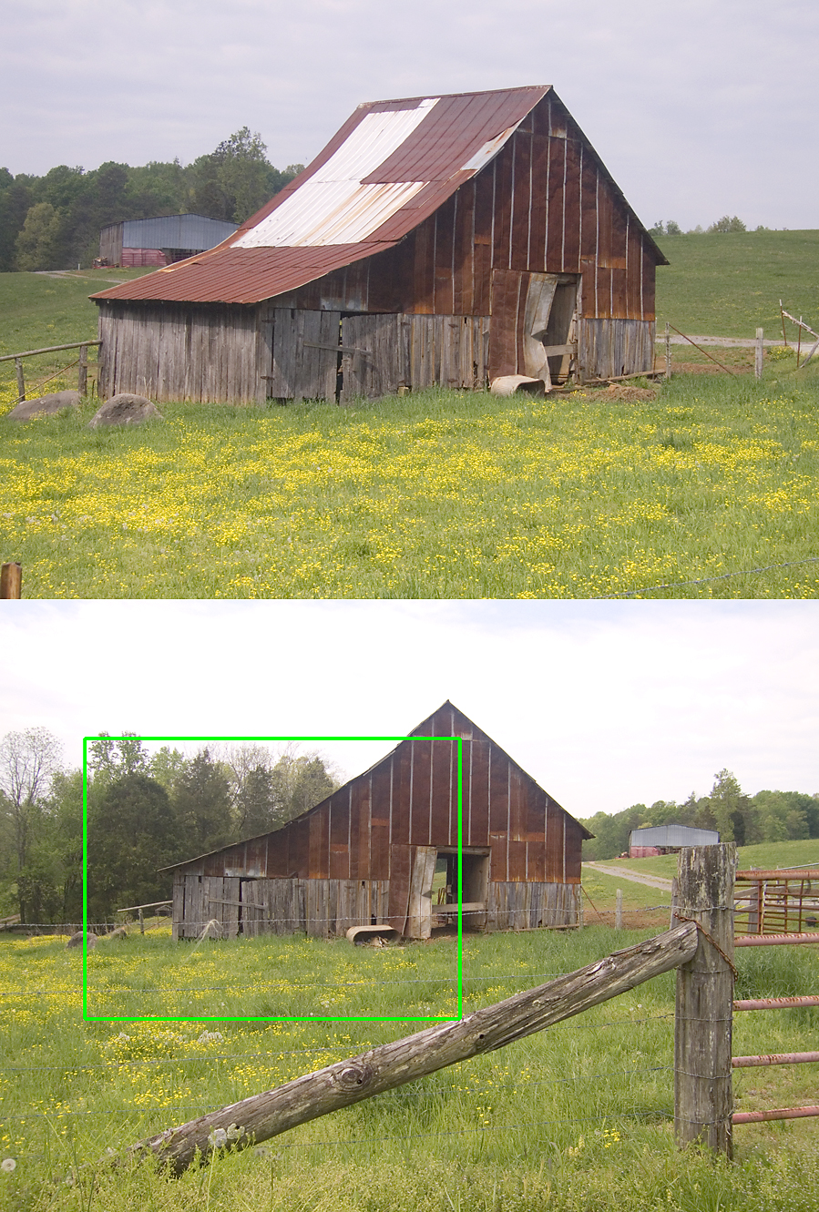 |
| A few reference photos, and how I cropped the view. |
I proceeded to sketch my design on the heavyweight watercolor paper. I was bothered by the lack of a “focal point.” I thought of adding a farm animal (horse or cow), but that didn’t seem interesting enough, and might detract from the barn too much. It finally came to me – what I call “Christian barn graffiti” would be perfect! It’s quite common here in the rural South to see hand-scrawled religious messages – even lines of scripture – painted on old barns. Lettering naturally captures your eye in a painting, but positioning this graffiti in my painting was critical. I hand-wrote the words “Jesus Saves” on a clear piece of plastic, at a size in proportion to the barn, and moved it around on my pencil sketch to determine where the words should be added. The lettering needed to be logical to the painting, not covering hinges or going across a door opening, and not taller than a person would stand to paint them. And the words needed to work with the overall design. The left end of the barn seemed ideal, especially if I simplified the background trees so the strong diagonal of the roof angle would strongly point in that direction. In addition, the water tub – as a singular element, standing out lighter color than its background – would balance the graffiti on the right half of the scene.
I haven’t painted in watercolors for a while, so I also used this painting as an exercise to reconnect with the medium. In the past, I’ve worked with a “limited palette” – just a few watercolors for a whole painting – and had good success. (See some examples in my gallery: Americana, Molly By The Sea, No Turning Back.) Limiting the colors naturally creates harmony, since you don’t have one area of the painting screaming out for attention simply due to being a different color. If you remember your grade school lesson on primary colors, you know that blue, red, and yellow are mixed to create all other colors. That theory is basically true, depending heavily on the purity of the primary hues chosen.
 Anyway, without getting too technical, I did this entire painting with only 3 paint colors, shown in the swatch. All the greys, rusty colors, and greens of the grass and trees were mixtures of these colors; the only place I used the paint just as it came out of the tube was for the yellow wildflowers in the foreground. It was a challenge which I found really intriguing. Let me know what you think!