I’ve done many paintings in watercolor using a “limited palette” – basically mixing all the colors from the primary colors of red, blue, and yellow. One of the first times I tried this was for “Americana”. More recent examples include “Grandpa’s Fiddle Break,” “Jerry Van, Music Man,” and “Jesus Saves.” For some reason, I never thought about doing the same thing with my acrylic paints until recently.
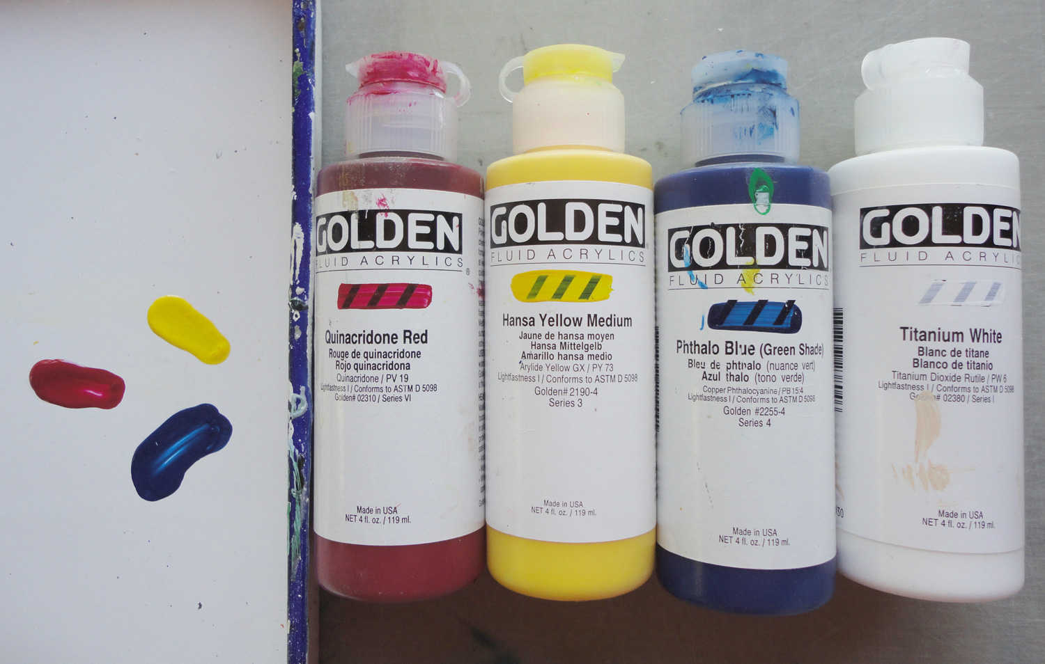
I was exhibiting at an outdoor show and I wanted to set up a small area on the end of a table in my booth to do some painting. Passersby like to see artists at work, but the artist usually spends more time talking than painting. So I wanted to work small and I didn’t want to bring lots of art supplies – an ideal chance to experiment with a limited palette of the acrylic paints I use, Golden Fluid Acrylics. Golden Paint has great resources for artists and their website is very informative. The website even has a “color mixer” so you can test various colors. I also have a “Golden Acrylics Color Mixing Guide” booklet in which they recommend an artist’s palette using eight colors:
- Hansa Yellow Medium
- Quinacridone Magenta
- Phthalo Blue (green shade)
- Quinacridone Red
- Naphthol Red Light
- Phthalo Green (blue shade)
- Yellow Ochre
- Titanium White (or Zinc White for more transparency)
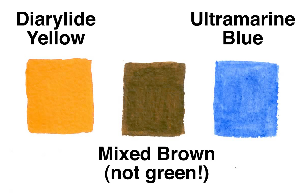
In theory, red, blue and yellow, called the primary colors, mix to create all other colors. In reality, you have to be careful which hues you use. It’s easy to end up with brown instead of green from mixing an orangy-yellow with a redish-blue, like the sample I picture here, in which I used ultramarine blue and diarylide yellow. This is because both the yellow and the blue have red tones in them, rather than being more “pure.” I highly recommend Blue and Yellow Don’t Make Green – an excellent practical book on mixing artist’s pigments.
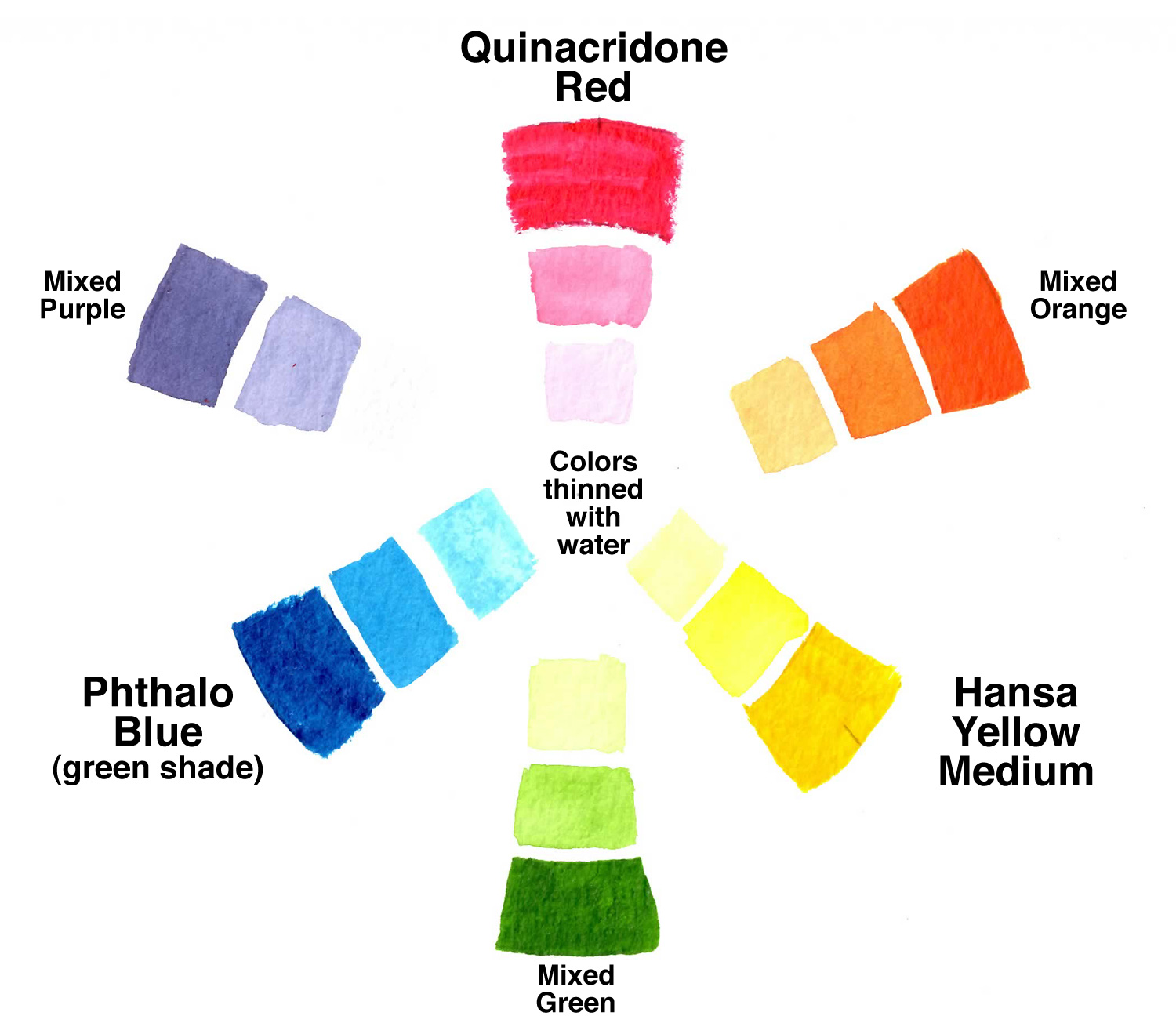
With Golden’s recommendations, I chose 3 colors I already had in my collection: Quinacridone Red, Hansa Yellow Medium, and Phthalo Blue (green shade) and packed a bottle of Titanium White also. Remember, mixing all colors from the primaries works in theory, but the reality is not perfect. The three colors I chose are high chroma or bright colors, and that’s why the others in Golden’s recommended 8-color palette listed above are used, to tone down the hues and make more natural earthy colors. Also, the Hansa Yellow Medium in my selection is not a strong ‘tinting’ color, so I have to use more of it than the other two primaries when mixing. For example, to mix a medium orange I need more of the yellow than the red, rather than equal amounts of each. Golden mentions this in the Mixing Guide and recommends Hansa Yellow Opaque instead, but since I was using the colors transparently I didn’t go that route. Notice that black is not included in these palettes; mixing complementary colors (colors opposite on the color wheel, like red with green) yields black and grays which are rich and vibrant; black just tends to dull a color. Mixing complements also reduces their intensity. Before packing my paints for the show, I made a color wheel and also mixed white, black, and complements with my 3 primaries, as helpful guides.
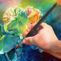
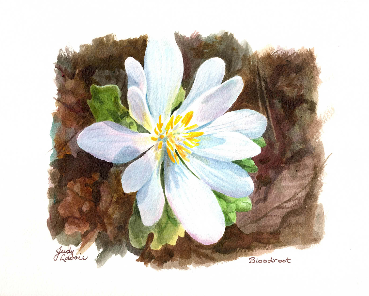
It’s springtime and I am overwhelmed with the beauty of the blooming wildflowers on my land, so I decided to do a small flower painting, using my limited palette of acrylics on watercolor paper transparently. My subject was a bloodroot flower, which is one of the first flowers which open in late winter, with pure white petals against the forest floor. When I paint with acrylics on watercolor paper (vs. on canvas), I mix the colors with water and Golden Acrylic Glazing Liquid. The latter slows the drying time, facilitates blending, and allows for transparent layers of color. Golden paints are very rich in pigments, so I literally put out one drop at a time on my little butcher tray, and mix away. This proved to be a good setup while in my show booth, since I wasn’t filling a palette with loads of different colors only to have them dry up while I stopped to talk to a shopper.
I was surprised to have enough painting time during the 2-day show to complete this small painting. The limited palette experiment was successful; I was able to mix all the colors I wanted to use, including the variety of warm and cool browns in the background leaves. The primaries did prove to be bright colors, so I used the white, thinned down with water, as a top coat on the flower petals, to tone the colors down. I consider this painting more of a ‘study’ than a finished work of art, and decided to leave the rough edges of the image.