I love the creative opportunities I have when designing and painting a landscape. If I’m not depicting a “landmark,” as I described in my August post, then I have the freedom to invent my own scene. As I’ve mentioned in the past, I keep a big reference file of my own digital photos, from which I have fun borrowing and combining elements when painting a landscape.
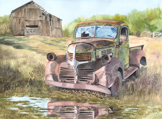
I often create landscapes with one main focal point, like a building or an old vehicle. Then my challenge is to give the focal point a “setting.” This focal point somewhat dictates the other elements I choose to incorporate into the scene, since I want it to look plausible and realistic. The old truck in “Out To Pasture” (shown above) seemed suitably positioned with an old barn in the background. If I’m working from a photo I took of my focal point when it was partly in shadow and partly in the sun, I want to make the whole scene looks sunny, and choose other elements which are lit by the sun from the same direction. Sounds kind of obvious, but this takes some extra effort. I also want to select other elements to add to the scene that logically go with my subject – an old farm tractor under a palm tree on a city street would not suit me!
“Elle’s Tobacco Planter,” in which an old piece of farm equipment is my focal point, is another example of a landscape scene I dreamed up. In reality, the tobacco planter is located on the side of a gravel driveway in a fairly wooded area. By creating a winter setting with a simpler background, the tobacco planter – my focal point – stands out and gets more attention.
Where I position my focal point within the scene is my first design decision. A landscape is composed with layers of depth, from the most distance to the closest elements. For example, the sky would be the furthest point away, with distant hills or mountains or woods next, closer buildings or trees in front of those, and foreground elements in the front. This is often the order I follow when painting a landscape with acrylic paints – painting the parts furthest back first, and overlapping until I reach the front. My tendency is to position the focal point closer to the foreground than to the background, but back far enough for me to have other elements in front of it. This might be as simple as putting the puddle in front of the truck in “Out To Pasture.”
“Aerial perspective” (aka “atmospheric perspective”) is a painting technique used for centuries to create the illusion of depth in a landscape painting. You’ve seen this yourself as you look at distant mountains; those furthest away are fainter, lighter in color, less detailed, sometimes out of focus, and “cooler” tones than nearer mountains. Such distant landscape components often look like there is a white/blue haze over them. When I’m painting with acrylics, I sometimes actually mix up a semi-transparent glaze with white and a small amount of blue paint and brush it over the most distant elements to make them appear to be far far away. I used this concept when painting the mountains of “Elle’s Tobacco Planter” (I actually depicted the mountain view from my front porch). “Out To Pasture” was painted in watercolor, and for the most distant trees I let various shades of green paint mix together on wet paper to soften the look. The background hill in “November” is very soft and lacking details, nearly blending into the grey sky, but you still read it as trees.
“Linear perspective” is another artist’s technique to create depth and dimension. If you were to stand in the middle of railroad tracks, you’d see as they recede into the distance it appears that the two rails get closer and closer together. In my painting “Out In Elkton” I use this concept for the roadway on the right, for the trees which line the road, and for the fence rails on the left; each of these getting smaller as they head into the distance. Linear perspective can also be applied to a building. In “November,” if you were to lay two rulers on the smaller shed building, you’d see that the line which defines bottom edge of the roof and the line which defines the ground level on that side of the building get closer and closer together as they go off into the distance to the left.
Try creating your own landscape!
