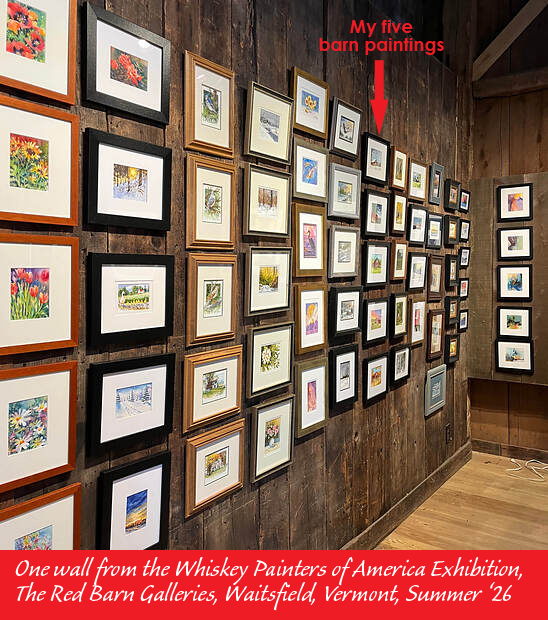
As an official whiskey painter, I can enter several Whiskey Painters of America (WPA) exhibitions this year, held in different locations around the US. Unlike most shows I have entered over the years, these have no juror, no judging, no awards; every whiskey painting entered (by a bonafide member of the WPA) gets exhibited. Most often, each artist’s work is grouped together. As the photo shows, these groupings of mini watercolors create an impressive display like no art show I’ve ever been in.
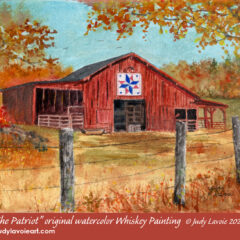
Which brings me to one of the ways whiskey paintings have changed my watercolor focus. My first series was planned as my entries to my first WPA exhibition, in a Vermont venue called The Red Barn Galleries last June and July. It included five 5” x 4” mini watercolors of red barns, each with a red, white and blue barn quilt (for the country's 250th). In my 40+ years as a fine artist, I had never done variations on a theme like this; I discovered I really enjoyed creating them, giving each some individual character. I also liked them as a group presentation. Other people evidently liked them too: to my delight, two of the five sold at the show. As a student of art history, I can’t deny the success of Claude Monet’s series of Haystacks, Rouen Cathedral, Water Lilies, and others, which allowed him to explore his subject with various changes in lighting, weather and seasons. Note to self: paint more SERIES!
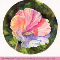
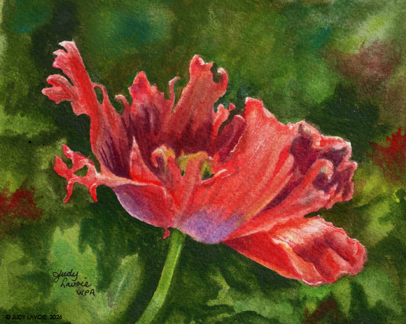
So for my next whiskey show, which allows eight entries, I decided to paint a series using one of my favorite painting subjects, flowers. As a warm-up exercise, I did a 4”x5” whiskey painting of a red poppy - a subject I’ve done in the past as a large watercolor painting and as an acrylic on canvas. I had watched a video where the artist used watercolors with watercolor pencils for a gorgeous floral painting, so I used some colored pencils from a tin of 24 Faber-Castell Goldfaber Aqua pencils I already owned. It’s hard to compare a mini painting with a huge painting of the same subject, but I was not quite satisfied with this new poppy. It didn’t “pop.” I wanted to make the flower glow, but it wasn’t there yet. So I decided to turn my focus to painting a white flower in strong sunlit.
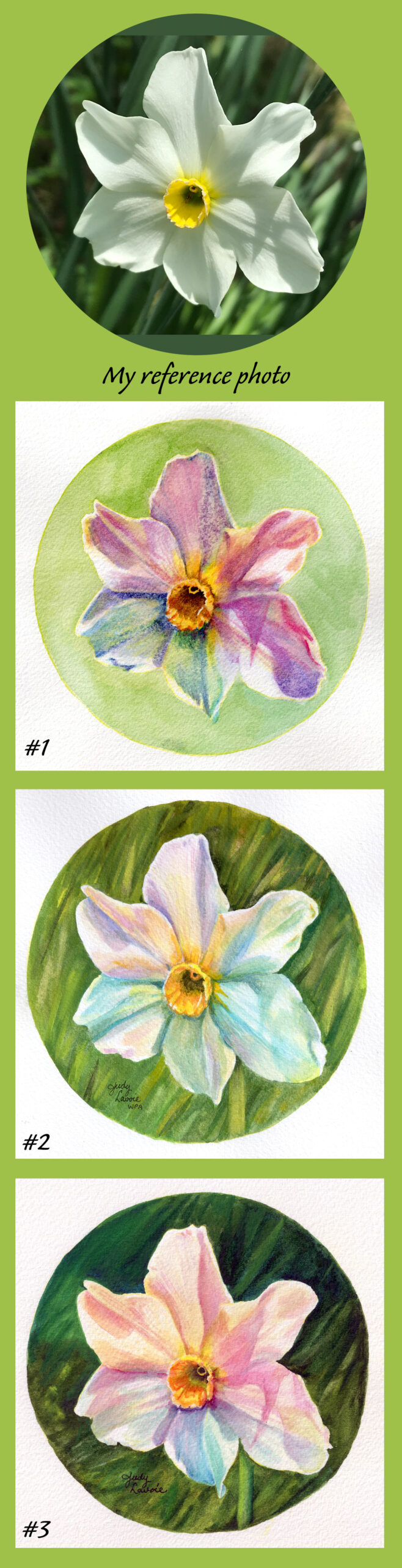
A narcissus from my garden was my chosen subject. I learned another whiskey painting lesson from this exercise: paint the same subject more than once and it can improve each time. The first one was too colorful - the flower petals didn’t even look white. The second try was better; there was some depth in the petals but I didn’t like the purples and blues. I was less than happy with even my third attempt at the narcissus whiskey painting, but I was learning with each attempt. I felt I was capturing the 3-dimensionality of the flower, but it was still too colorful, even for me, one who uses color boldly in my art. It still lacked the glow I was striving for. But I liked how the darker greens of the background made the flower look in contrast and decided this was a good choice for my continuing floral series.
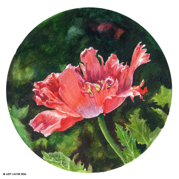
Remember whiskey paintings are tiny, so these exercises take little time compared with my customary large watercolor paintings. So my next attempt was a return to the red poppy. This time I chose my watercolor pigments more carefully, concentrating on those which are very transparent. Even the finest professional watercolors include a range of pigment choices from very transparent to opaque. With more whites left unpainted and lighter shades where the sun was shining through the thin petals, I could see improvement over the previous mini red poppy.
See my next blog post of where my floral series took me next!