I’ve just completed five new watercolor Whiskey Paintings, in preparation for my first time participating in an official Whiskey Painters of America (WPA) exhibition. It’s the 14th Annual Green Mountain Watercolor Exhibition, held in The Red Barn Galleries, located in Vermont. The Whiskey Paintings will be exhibited along with watercolors (sans whiskey) of the local Valley Artists Guild.
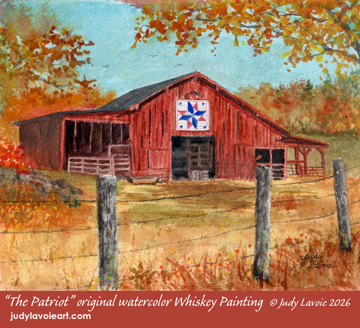
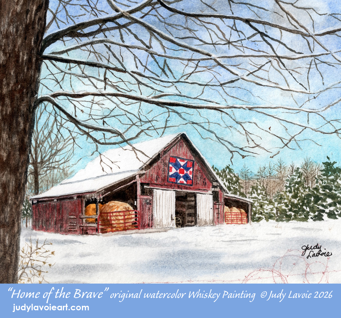
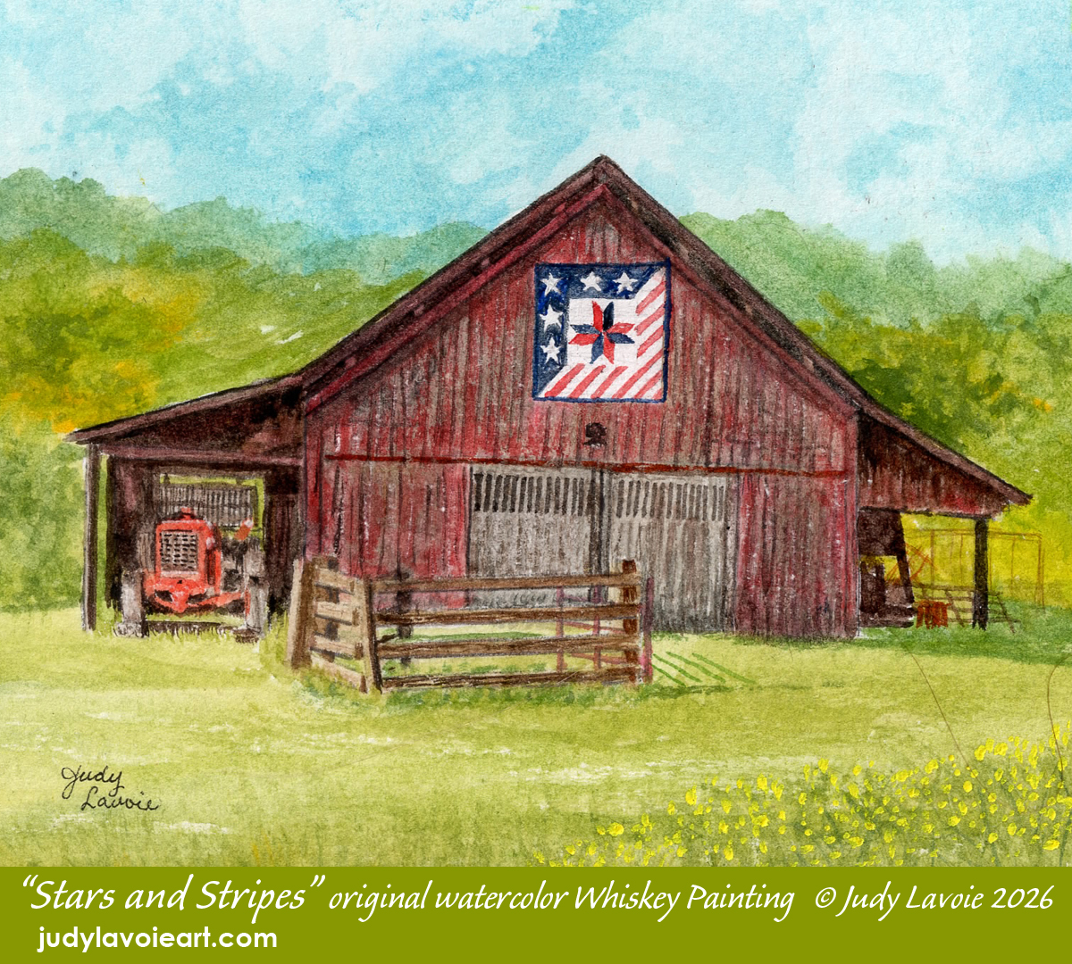
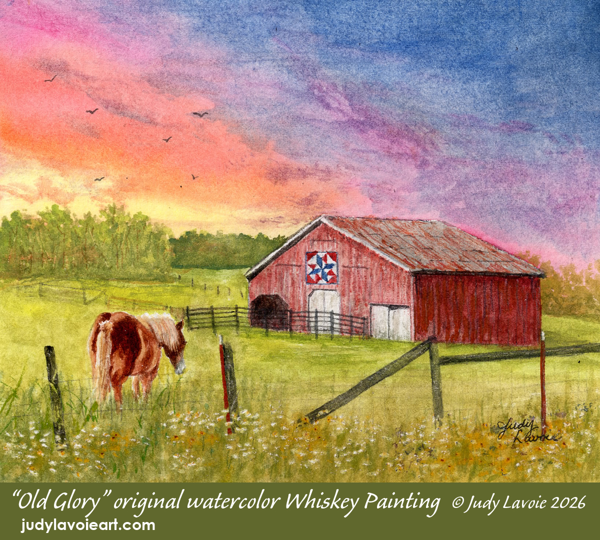
I got the idea to do a series of related images for this show, using a ‘red barn’ theme. I have oodles of barn photos in my reference files just waiting to become painting subjects. Since the show will run through the upcoming July 4th holiday - celebrating the 250th birthday of the USA - I wanted to add a patriotic feature. What could be more appropriate than red, white and blue “barn quilt” designs!?! The painting titles would also reflect my homeland. I planned to do one Whiskey Painting for each season plus a fifth in a moonlit setting with warm lighting inside the barn… if I could pull that one off!
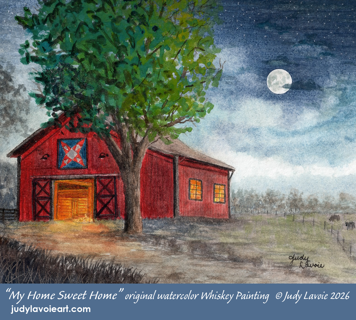
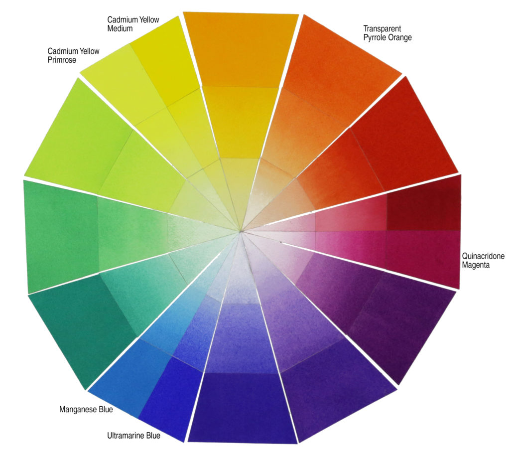
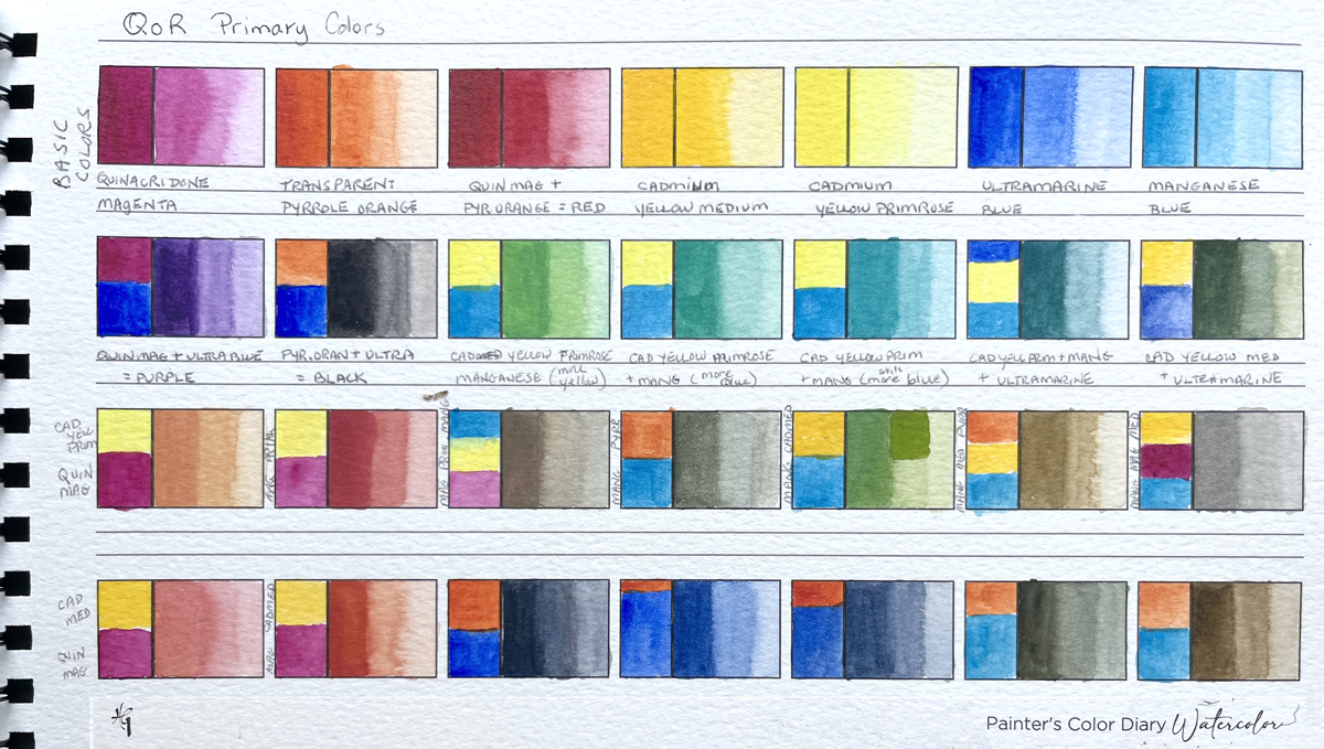
To create a uniform visual appearance in this painting series, I wanted to paint each with the same set of watercolors. I turned to Golden Paint’s QoR watercolors which are a favorite of mine. I’ve often painting with just three primary colors (red, blue, yellow), so I referred to the Golden website for their pigment recommendation. There I discovered a suggestion of 3 warm primaries and 3 cool primaries, along with their color wheel showing how those would mix. With a limited palette you might not get the desired mixing results by choosing just any red, blue and yellow hue. Red plus blue theoretically mix to form purple, but this is not true for every variation of red and blue. For example, a red with lots of orange tones mixed with a blue with green tones would not mix to create an attractive shade of purple. The mixture would likely look like purplish brown mud! In my stash of watercolor paints I had all six recommended QoR colors so I made my own test swatches (see below), as I often do when limiting my colors, and I liked the results. The colors were Quinacridone Magenta, Transparent Pyrrole Orange, Cadmium Yellow Medium, Cadmium Yellow Primrose, Ultramarine Blue, and Manganese Blue. With these I could create a wide range of mixed colors which would accommodate everything I was aiming for in this series - good barn reds, blue skies, various greens for foliage and pastures, and a rich black. Incidentally, only two of the barns in my photos were actually red, so I would change the coloring on the three which were weathered grey.
One designation of a real Whiskey Painting is that it is done with watercolors thinned with any alcoholic spirit. I decided to use Jack Daniels Old No. 7 Tennessee Whiskey. This seemed most appropriate, since Tennessee is my home state and all the barn references I planned to use are located in Tennessee. I have found that adding whiskey to my diluting water doesn’t have a big affect on the watercolors. The wet paints dry a bit faster (alcohol evaporates quicker than water) and a test I did showed that it is a bit harder to “lift” dry paint off the paper by rewetting than it would be if no whiskey were used. But otherwise the added spirits hardly make a difference - other than creating a novelty!
Official Whiskey Paintings must measure no more than 20 sq. in., so each of my paintings is 5” wide x 4” tall. Because these are miniatures I decided to use a much smoother paper than I normally use, selecting Arches 300lb. Hot Press, thinking it might take the detail work better. Small size doesn’t hinder my love of detail but I admit I had to use tiny brushes and a steady hand to paint the mini barn quilts. I wanted each little painting to stand alone as an interesting scene, so I used various viewpoints (straight in front or at an angle to the barn), different skies (clear, cloudy, sunrise, night), unique elements (the fencing, a tractor, hay bales, the horse) and foliage and flowers to suggest the seasons.
I discovered along the way that a miniature painting is not necessarily done faster than a bigger size. The same amount of time for planning, creating the composition, and testing the color palette is required as for a large watercolor. Even the painting time is not super quick, especially with so much detail. But when you love what you are doing it doesn’t matter how long it takes - as long as I make the submission deadline and don't count on earning an income that covers my time and expenses!
I like that Whiskey Painting exhibitions are not juried (meaning all work submitted which meets the specifications will be exhibited), not judged for awards, and the artwork is always for sale. From what I have read, Whiskey Paintings are collectors' items. I had great fun creating this series and look forward to participating in many more Whiskey Painting shows.
EXHIBITION DETAILS
14th Annual GREEN MOUNTAIN WATERCOLOR EXHIBITION
June 11 ~ July 19, 2026
The Red Barn Galleries at Lareau Farm, Rt. 100, Waitsfield, VT 05673