Japanese Honeysuckle is an introduced, somewhat invasive, climbing vine which grows on my land. The frilly white blossoms are highly fragrant and last from April to July, and I don’t mind their intrusion. The red young stems are strong and used in traditional basket weaving. As it grows, the larger woody vine will grow in a spiral around a tree branch. When the vine is removed, the branch is left with a twisted appearance, which some woodcarvers prize for creating unique walking sticks.
One sunny day I did a photo shoot with my honeysuckles, when the large white tubular flowers (which turn buttery yellow with age) and their showy curved stamens stood out starkly against the shadows of the forest. The brigh

t green leaves seemed to be x-rayed by the sunlight. The photo I chose as reference for my painting has the vine growing on an angle, with great variety in the flower and foliage shapes, interesting highlights and shadows, and strong contrasts. I knew the diagonal composition could create a dynamic painting if I could draw attention to the blossoms and balance the shapes against a subtle background.
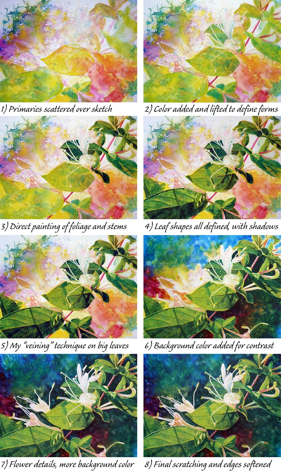
I chose to work bigger than life, on a 24″x18″ white Ampersand Art Aquabord with watercolors. I recently completed a few small Aquabord panels to experiment with blending colors and creating textures, as shown on “Flame Azalea.” The Aquabord’s clay surface makes watercolors vibrant and allows me to lift off color to reveal lighter values or pure white. I also love to do some scratching into the white clay layer, usually as my final step, to reveal the whitest highlights and finest details. I knew this would be the ideal surface to capture the loveliness of the Honeysuckle. I chose a limited palette of primary colors, using some tubes I bought long ago of American Journey watercolors – the high-quality house brand of Cheap Joe’s Art Stuff – including Sour Lemon, Rambling Rose, and Joe’s Blue. Some of these colors are discontinued, but you can still get similar hues from Cheap Joes. My testing showed that these three mixed into vibrant secondary colors, which was the effect I envisioned for my painting. (See my color swatches on this previous blog post).
I transferred my sketch to the painting panel then diluted each of the three paints with water in small cups. Using a different brush for each color, I painted, dabbed, spattered, and used a small straw to blow the pigments and encourage random mixing. I spritzed with a clear water spray too. Aquabord absorbs watercolor more slowly than cotton watercolor papers, so I avoid broad wet washes since the colors tend to mix too much and/or flow right off the panel. I knew where my flowers would be, so I directed less paint in those areas, as well as manuevering a yellow/blue mix over the main leaf areas. I can’t be too out of control, you know! As the in-process photos show, I lifted the lighter tendrils of the stamens in Step 2 to help me see where they fell, then started direct painting the colors onto my shapes, working light to dark.
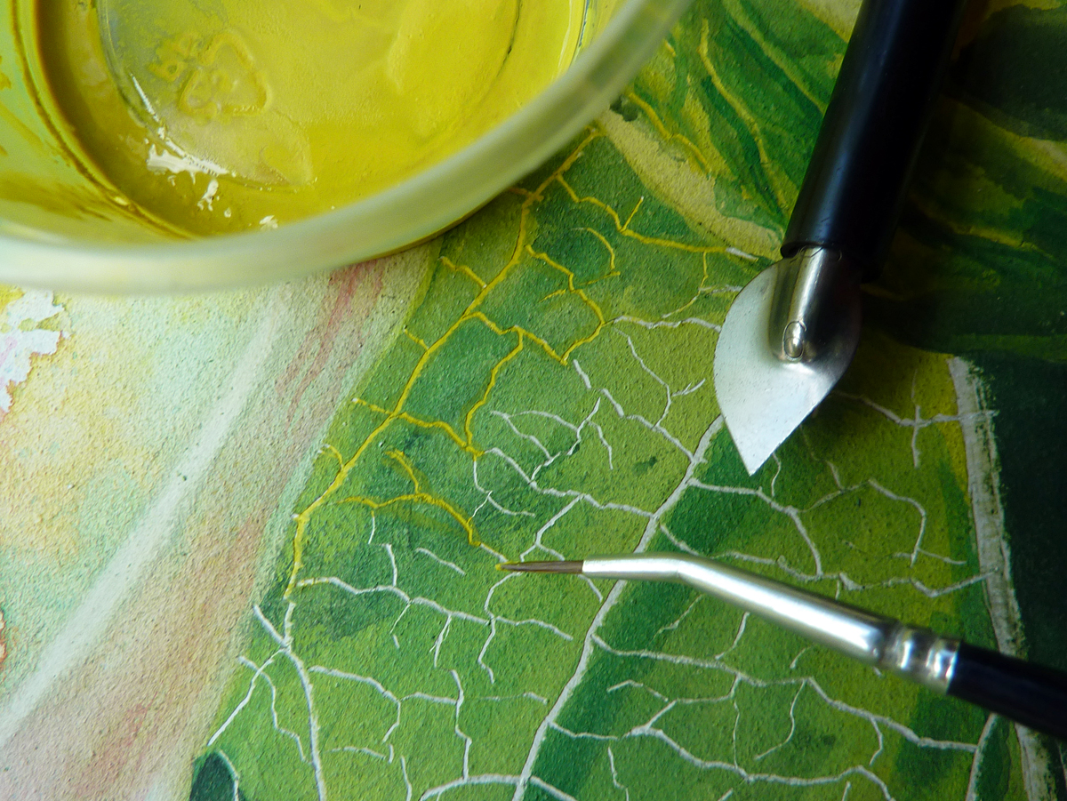
I had a brainstorm about how to create the lighter fine veins on the main leaves. I experimented with my idea first on a small piece of Aquabord, and I knew right away I was onto something good. On the big leaf in the lower left, I used the point of a Speedball nib with a curved blade, which is a bit thicker and more rigid than an x-acto blade or a scalpel. With this tool, I lightly scratched through the green paint to reveal the white clay board below, as my photo shows. I widened the lines slightly for the bigger veins and for the center line of the leaves. Then I diluted my yellow paint with a small amount of water so it wouldn’t be runny, used a tiny brush, and filled in those fine white lines with paint. Not so hard as it might sound; the scratches are slightly recessed into the clay surface, so the paint naturally flowed into the narrow channels. Voila, veins! To add further realism, I painted darker green values along the lower side of the fine veins once the yellow paint dried, to indicate the shadows I could see in my photograph. If you are reading this on my blog page, you can click on the in-process photo collage to enlarge it and look more closely at the difference between Steps 4 and 5. I didn’t do as much detail work on the leaves in other areas of the painting, since I like to reserve the greatest detail and emphasis for my center of interest. This ‘veining’ step might sound tedious to some, might never be noticed by many, but put the frosting on the cake from my point of view… and it was fun to do!
I used my paints diluted to pastel hues to add shadows on the flower petals, inventing them since the whites were a bit over exposed in my reference photo. For added drama and more attention on my main subject, I used the three primary colors, straight and mixed on the palette, and gradually moved around the panel to create a dark, but interesting, background. Again I used the Aquabord’s unique properties to lift color, both to reveal some of the brilliant color layers below my dark mix and to create a soft, out of focus appearance. My final painting step was to use diluted blue paint over some of the furthest back leaf shapes, particularly in the top right. I tried to apply it with one brush stroke over the color already in place… that ‘lifting’ ability can work against you if you dampen or brush over a section too much. Blue glazes help to ‘push back’ an object in the painting, adding dimensionality. You can see the difference if you look closely at the leaves between Steps 7 and 8. At the same time, I softened some of the edges of those same leaves by slightly rubbing my brush along the hard edges, which helps add to a look of distance.
In my final steps I used the scratching nib again to create highlights along the top edges of some leaves, and to sharpen the whites of the petals and stamen parts. A really close look reveals some fine white hairs on some of the plant parts, which are easy to scratch out. I used the curved edge of the scratching nib to wipe away broader areas of color, like within the blossoms and on the highlighted surface of the small leaf which falls around 7 o’clock in the painting. Gently passing this tool over the slightly textured Aquabord surface helps me control how much paint I am removing.
I’ve entered “Honeysuckle,” along with another Aquabord done a few months ago, “Little Georgia Peach,” into an upcoming watercolor exhibition. Most of my watercolor exhibitions do not allow to use of a clayboard surface, limiting entries to those on paper, so I jumped on the opportunity when I saw the broader scope of this show’s specifications.
P.S. I got this painting into the 2020 Georgia Watercolor Society’s Member Exhibition!