My bearded irises have flowered beautifully this spring, inspiring me to paint them. The delicate petals are ruffled and nearly transparent, with one group growing upward and the other down. Their feathery ‘beards’ and tightly folded buds provide additional interesting shapes and values. As usual, I took far too many reference photos, being especially drawn to those with backlighting. I wanted to give a different twist to painting an iris, and I was inspired by the paintings of an artist named David Smith. I decided to follow his lead and use a limited palette of primary colors, one of my favorite ways to paint.
I don’t often paint the same subject in two different ways, but this time I did one iris on paper and a second one on #Ampersand #Aquabord. With the palette of three primaries it didn’t matter the actual (or ‘local’) color of the flower, since the colors in the painting would not be true to life. The paintings would depend on values rather than on colors to define the subject. The first painting was drawn from one of my favorite irises, a pale yellow variety called Total Recall. The second painting is from a peach iris with an orange beard which is named Pink Attraction. I printed my reference photos of each to guide me, but simply as black and white laser prints so I could concentrate on the values, from the whitest areas through the midtone greys to the darkest shadows.
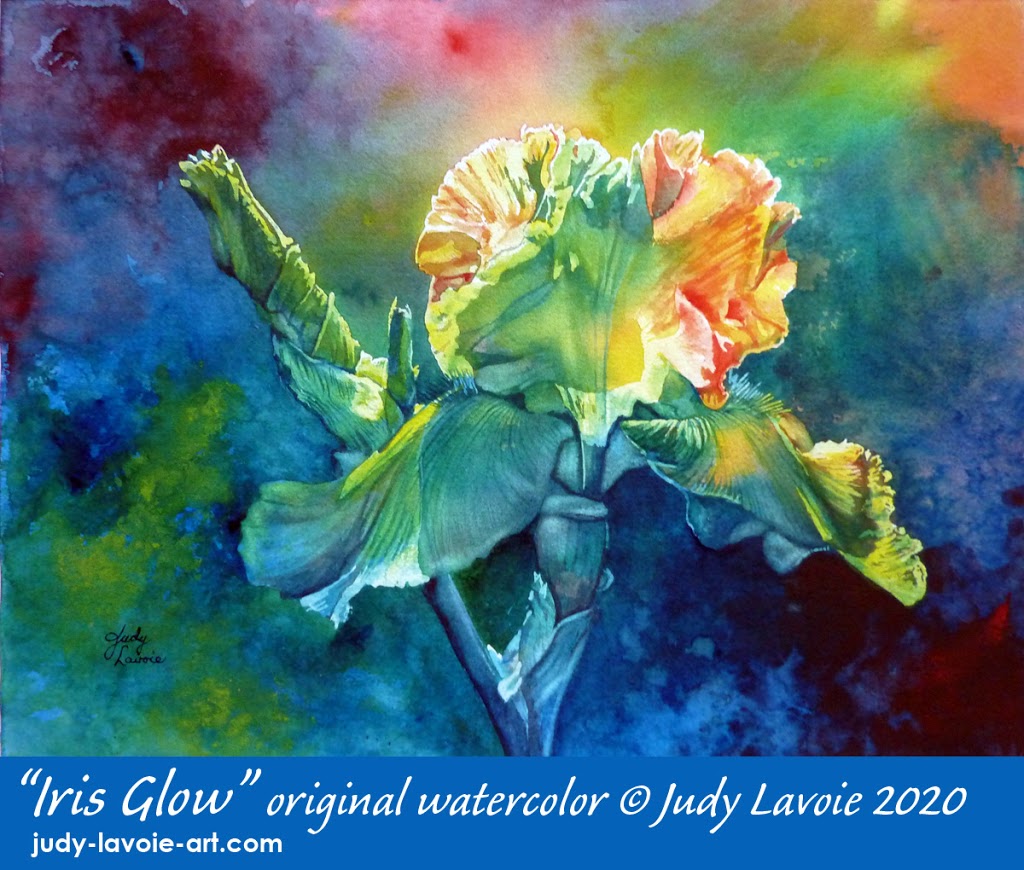
 IRIS GLOW:
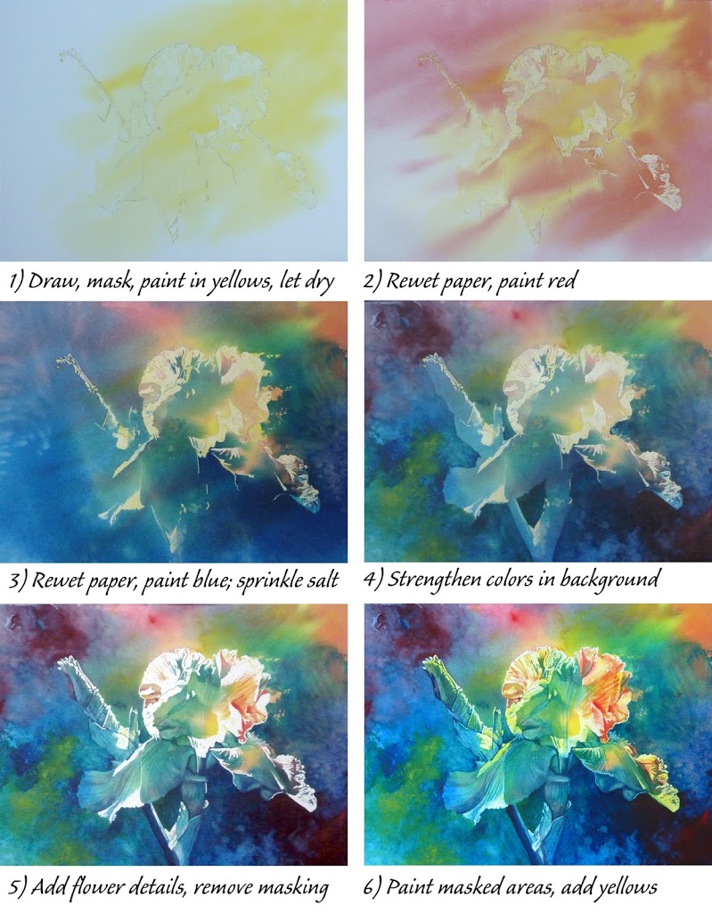
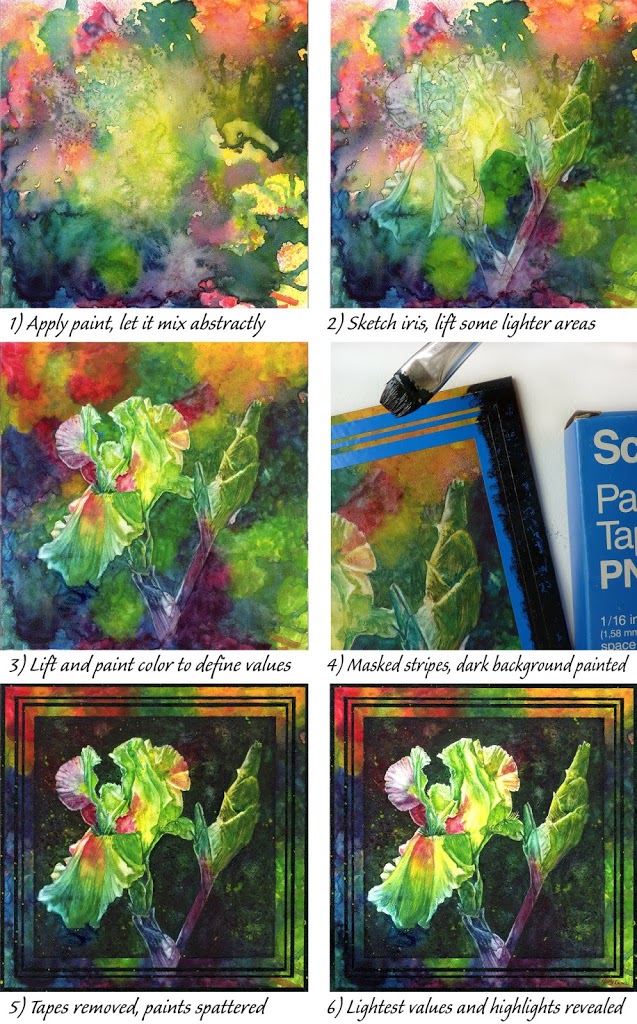
For “Iris Glow” I used a 15″ x 11″ sheet of 140lb cold press watercolor paper taped to gator foam, with the three colors shown and labelled in the top row on my swatch chart. I used making fluid to preserve the lightest values, applying it with the beveled back end of a paint brush handle. As shown in the in-process photos, I brushed on the yellow, then the red, then the blue. I allowed the paper to dry between each color, but sprayed the paper with water before adding the next color to allow them to blend somewhat randomly. I also tilted the painting board slightly on an angle before the paint dried, making the colors move diagonally. Before the blue dried, I sprinkled the far left and right sides of the paper with table salt, which creates a mottled effect, adding a bit more interest and texture.
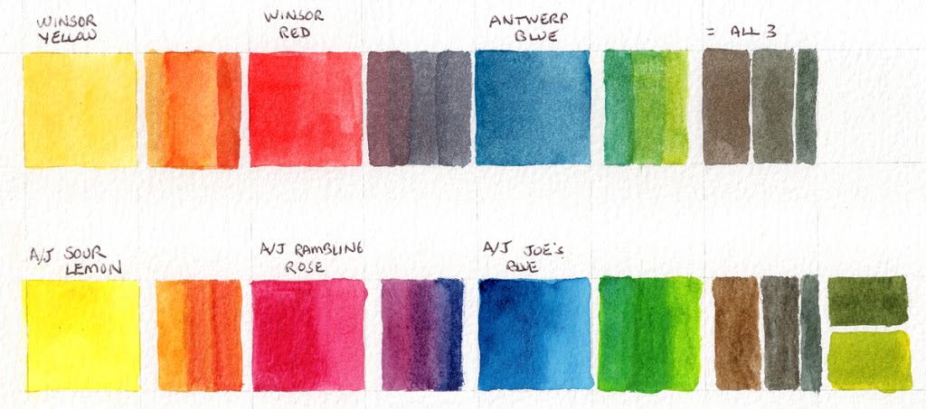 |
| Primary color swatches – top row for “Iris Glow,” bottom for “Rainbow Iris” |
Once my initial paint applications dried and I brushed off the salt residue, I concentrated on painting the background, adding more of the same colors already on the paper. I used these darker values to help define the flower and provide contrast with its lighter values. With the masking still in place, I next painted the flower and bud, darkening areas to create 3-dimensionality. Between steps 4 and 5, I removed the masking to reveal pure white paper. Masking fluid can leave sharp edges and stark areas, so I softened some edges by rewetting the colors adjacent and I also painted over some of the white areas. Glazes of transparent yellow make the colors pop and enhance the backlighting effect, so I used this in various places. I reserved the pure white for the strongest highlights, mostly around the edges of the petals.
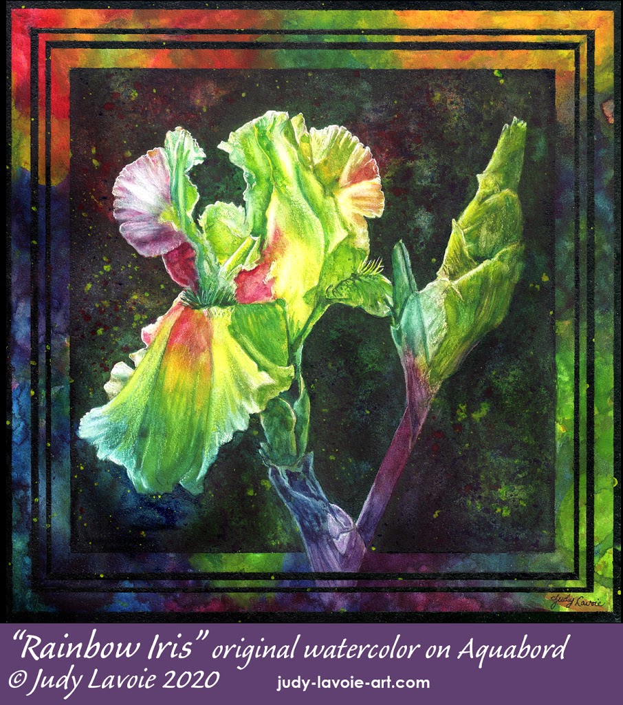 RAINBOW IRIS:
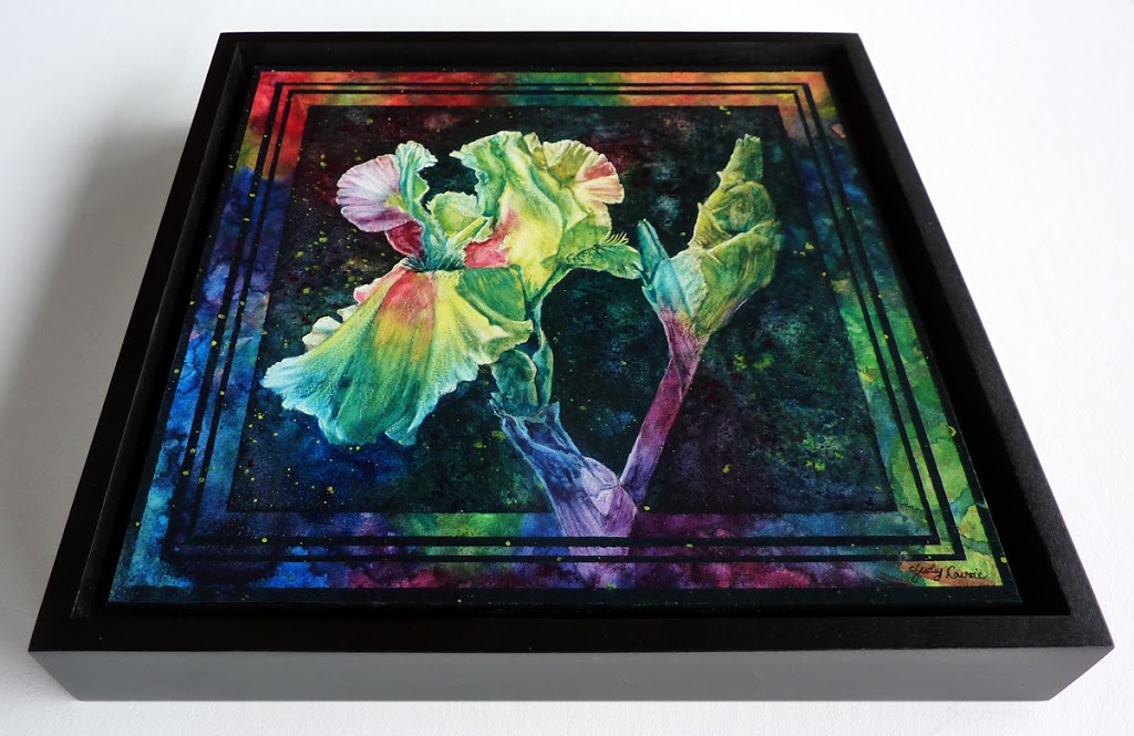
My approach for “Rainbow Iris” was different from “Iris Glow,” due to the unique characteristics of Aquabord vs. watercolor paper. No masking fluid was needed, since Aquabord’s white clay surface allows paint to be re-wet and blotted off or lifted away with a thirsty brush (i.e. the brush is dipped into clean water, then blotted slightly dry so it will soak up moisture when stroked on the re-wet painted surface). In addition, I generally use the Aquabord a bit unconventionally, and, as a final step of my paintings, I scratch through the paint to reveal the clay layer for the whitest areas.
For this second painting I used the three different primary colors than “Iris Glow,” those at the bottom of my color swatches, shown above. They were tubes I bought long long ago of Cheap Joe’s house brand American Journey: Sour Lemon = Hansa, Joe’s Blue = Phthalo, Rambling Rose = Quinacridone Rose (no longer available except in an iridescent version with mica platelets added). When I made the color swatches, I preferred the purity of the secondary colors mixed from these primaries, especially the purple, to those I had used in “Iris Glow.” You have to choose primaries carefully to get the mixes you desire; a reddish yellow mixed with a blue can likely create more of an olive green than a grass green, for example.
As you can see in step 1 of “Rainbow Iris,” I let the colors blend very randomly on the 8″ square panel. The clay surface of Aquabord absorbs the paint more quickly than does cotton watercolor paper, so I applied big droplets of each of the three diluted colors to let them mix. I also lightly sprayed clear water droplets to encourage merging pigments. I was careful not to get so wet that puddles formed, since I knew from experience that it might make muddy color mixes or might cause the paint to flow right off the panel. I tilted the panel a bit and even blew the paint around with a little straw to further add mixing. I laid it very flat to dry thoroughly. Once dry, I turned the panel in different directions to decide how I wanted to position the flower, then drew it in.
Steps 2 and 3 show the results of lifting paint away and adding paint to sculpt the flower with light to dark values. If you control the amount of water when re-wetting an area, you can lighten a color rather than lift away to the pure white surface. Using staining vs. sedimentary color pigments might also make gradual lifting easier. Applying and removing watercolor takes a bit of adjustment, but it is one of the qualities I love about Aquabord. I added more red to the top section of the background, and blue and yellow in the lower right corner, but left most of the rest of the background undisturbed.
I loved the brilliance of the background colors, but at step 3 I felt I needed to darken the background to make the flower and bud stand out in contrast. I remembered a old package of pin-striping tapes I found recently among my art supplies, a tape sold for painting accent stripes on vehicles, most likely. The three blue vinyl tapes (shown in step 4) come on a roll and are pre-spaced and adhered to white backing tape and a front clear carrier tape, which keeps them perfectly parallel as you lay them down. Once in position, I burnished the blue tapes against the slightly textured Aquabord surface and peeled off the clear carrier tape. Eons ago I did “French matting” on some of my floral paintings, and I figured I could mimic that effect in a new way. The blue tapes would protect some of those juicy background colors so they could still be an important part of the painting. To create the dark background I mixed my three primaries in a small cup without using much water, so the paint would be thick, less likely to ooze under the striping tapes, and less likely to lift the paint already in place. I actually created two dark mixes, one a dark green and the second close to black. I applied the heavy paint mixes with a stiff bristle brush over the tape with minimal strokes. I used a round brush to paint around the flower and bud, and scumbled the paint a little thinner and more randomly so the existing background colors could show through a bit. I also mixed the red and yellow paints slightly with water, loaded each onto an old tooth brush, and did some random spattering on the still wet background, shielding the iris and bud. Even though my watercolor paints were very transparent, they took on a more opaque effect when mixed so thick. This added more interest to the background as well as to the stripes themselves. Once everything dried I carefully lifted off the blue striping tapes and I loved the results… I’ll be revisiting this edging effect in the future.
I would not add similar striping around the edge of a watercolor on paper, for several reasons. Watercolors on paper need the protection of matting, which is most often cut with a window to reveal the artwork below, covering a portion of the outer edges of the paper. Even if I positioned the striping in from the edges, the painted paper might move around ever so slightly with the wiggle room of its mounting and with gravity when hung, causing the striping to appear off center. With a watercolor on Aquabord, the need for matting is eliminated; the finished painting can be sprayed with an archival clear coating and is protected without a mat covering any of it (and without glass or plexiglass).
 |
| The panel within a floater frame |
One other important consideration in adding the striping was that I intended to use a black “floater frame” for this 8″ square panel. A floater frame allows a painting to be mounted within the edges of the frame (vs. under the frame), so none of the artwork is covered by the frame. A floater frame creates a look of the art panel ‘floating’ on air. Many brands of floater frames are available, but I use those from Ampersand Art, the Texas-based company which makes the Aquabord panels I love. Their floater frames are specially designed to accommodate their 1/8″ thick panels (as well as their deeper cradled panels), with appropriate spacers sold with each floater frame. You can see the great effect in my photo of the finished artwork!
Which of these iris paintings do you prefer?!?!

Unknown
I prefer the darker picture that you showed second. Of course, I can't remember the name! The stripes and marbled effect along with the darker colors you used really seem to pick up the flower and make it stand out.