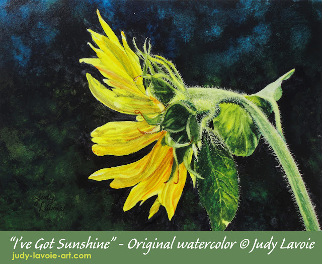
 When seed drops from our bird feeders into the gravel below the porch, I allow the germinated sunflowers to grow. The lovely blossom in this painting was inspired by my own photo, taken with side-lighting from the morning sun. The close detail in my photo revealed the fine hairs on the stem and leaves, which I had never noticed before. I decided scratchboard would be the perfect surface for me to create these thin white lines. My goal with the watercolor paints was to keep the petals and leaves very transparent and luminous, while creating a dark mottled background for dramatic contrast. It would be a good test of the new watercolors.
After sketching the flower in pencil on a small 7″x5″ panel of Aquabord, I dove right into painting. It was fun to depict the variety of shapes in the delicate yellow petals and the greenery on the underside of the flower. Sunflower petals are basically yellow, but you can see all the orange and green tones I used to make these look three dimensional. The leaf on the right was pale green from the sunlight, while the lower leaf was deeply hued with its veins backlit to appear yellow from the glow. The only tube of “green” in my QoR watercolor set was Viridian Green which is too blue to use as a leaf color, so I mixed my greens with Hansa Yellow and Ultramarine. You can see my test swatches below, showing the difference in greens blended from the two different shades of blue in my box, shown in the bottom row of swatches. Ultramarine combines with Hansa Yellow to create a natural green, where the Phthalo Blue mixed a green I can best describe as “high value” – too intense for this flower. Adding a bit of Alizarin Crimson to either green tones down the vibrance, since this red hue is the complement to green (opposites on a color wheel). The tiny swatches above the greens show this effect. Around the background, I dabbed random spots of mixed greens and Phthalo Blue, planning to create the appearance of distant shadows, with greenery and blue sky poking through the darkness.
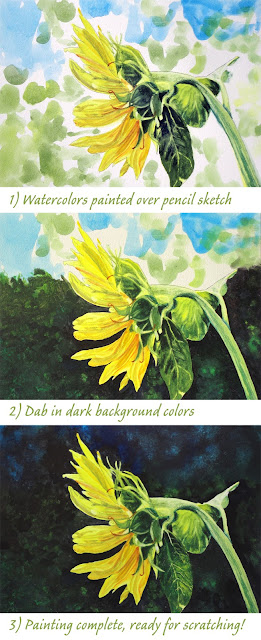
The dark background color was created by mixing Alizarin Crimson, Viridian Green, and Payne’s Gray – red and green, being complements, mix to create gray, and the Payne’s Gray made the intensity deeper while adding a slight blue tone. Aquabord has a smooth surface which can make for hard edges when color is applied. I used a pointed small brush to carefully paint the dark background colors around the flower, leaves and stem. Working in one small section at a time so the painted dark outlines were still wet, I used a blotting motion to apply the background colors on the open areas, blending with a dry soft brush. You can see how a dark background makes the blossom appear more vibrant than a white background when you compare photo 1 with photo 3.
 The final step, after the watercolors were thoroughly dry, was to use an x-acto knife and scratch through the thin layers of paint to create the downy fibers on the greenery. It was fun to see how alive such a tiny addition made the sunflower look!
I enjoyed working with the new QoR watercolors. Like Golden acrylic colors, these are pigment-rich, meaning I don’t have to use much paint mixed with water to get rich colors. They painted on nicely and stayed transparent where I wanted that effect. On Aquabord, re-wetting watercolors lifts them easily off the surface, which is not always so easy when using watercolor paper, but with my own test on watercolor paper I found the colors lifted easily, which is a good characteristic since watercolor can be unforgiving sometimes! Because Golden’s watercolors differ chemically from those of other manufacturers, I’m not sure about mixing them with other brands. I look forward to using QoR watercolors again.
MORE ABOUT MY WATERCOLORS
Typically I use professional (artist) grade – vs. beginner or student grade – watercolors from companies such as Winsor & Newton, Holbein, Da Vinci, and American Journey. For years, my preference when painting with acrylic paints has been Fluid Acrylics made by Golden Artist Colors. Founder Sam Golden is credited with developing the first artist acrylic paint and many other art products. Not only are Golden products of superb quality, but this employee-owned US company is committed to excellence, innovative, supportive of artists, and socially responsible. Golden introduced their line of “QoR® Modern Watercolors” in 2014, but I only recently became aware of QoR. I assumed Golden’s watercolors would give me the same fine qualities as I have enjoyed with their acrylics, so I decided to give them a try.
My left brain kicks in with a love of the technical aspects of artist paints. In researching QoR® I learned that Golden had developed them with their own patented binder (the foundation of the paint in which the colored pigment is carried) instead of using traditional gum arabic. While retaining the qualities of traditional watercolor, Golden describes QoR colors as more vibrant, luminous and lively, with more density than traditional watercolors. Their composition allows QoR watercolors to be rewet easily, even after a year dried on a palette… good for me since I often ignore my watercolor paints for long periods while I concentrate on painting with acrylics. The colors are described as staying brilliant even when they dry, where most watercolors fade a bit when going from wet to dry.
Golden created 83 QoR colors, including three iridescent colors. The QoR colors can be purchased in various sets (of 6, 12 or 24, in 5ml tubes) or in individual tubes. I decided to buy the QoR Introductory 12 Set, which included the colors shown in the top two rows on my swatch chart. It gave me a good basic color selection, to use the paints right out of the tube or for my own blends. Golden also offer sets of Earth Colors and High Chroma Colors. Bottom line – I like working with QoR watercolors.
