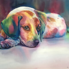
I’ve ventured forth once more with a watercolor “character” painting. Humans are my most challenging subject, but I like to push myself, knowing that it helps me grow as an artist. I don’t consider myself a portrait artist, but I love to capture people involved in activity.
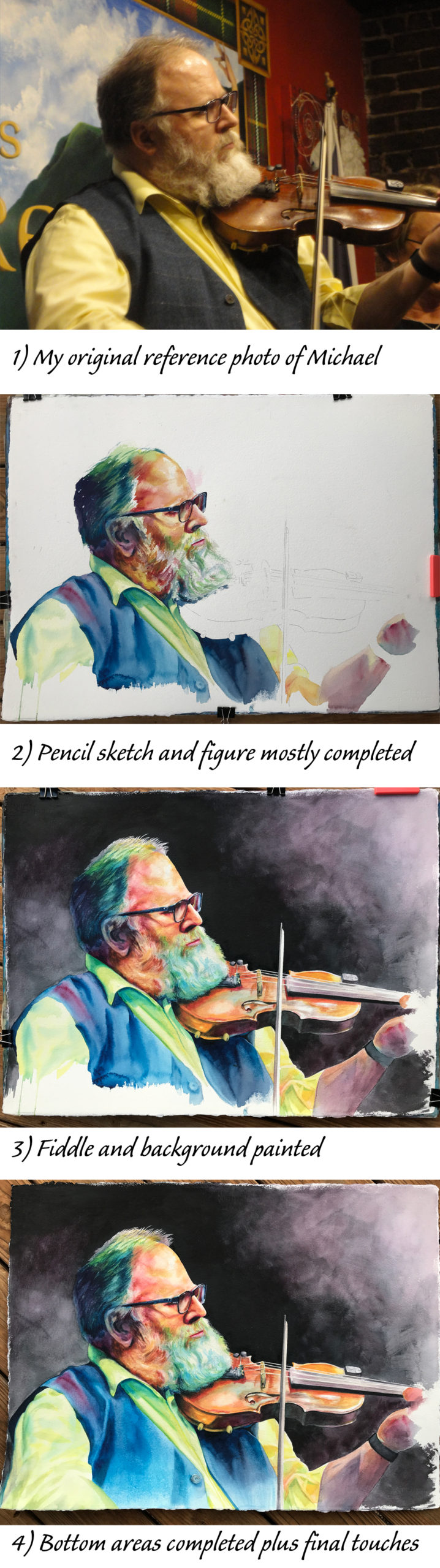
Two years ago I took photos of an amazing fiddle player named Michael at our favorite pub in Knoxville, Boyd’s Jig and Reel. While looking for reference for a new watercolor on paper, I came across the photos of Michael and remembered how the stage lighting, Michael’s concentration, and the festive atmosphere had inspired me to preserve the moment. I chose one particular photo in which I liked the highlights and shadows on Michael’s face, beard, clothing and fiddle. I also liked the composition the way I had captured it, with the bow balancing the vertical line of his upper body. I could eliminate the busy background to emphasize the figure and use strong contrasts to lead the viewer’s eye to Michael’s face, the focal point of my painting. In my mind, this could work.
As a transparent watercolor artist, I don’t use white paint, so the unpainted paper is my white. I knew my painting would have some areas of white, like the highlights on the eye glasses and nose, his hair, whites in the beard, the bow and the fiddle strings, but I didn’t want to use masking fluid to protect them. Instead, I planned my painting well, carefully sketched those areas I wanted to remain white, drawing the fiddle strings and bow with my trusty steel straightedge. While painting, I worked around those places to preserve them as whites, later going over some with a bit of color to tone them down. As a graphic artist from back in the pre-digital days I have a very steady hand so I am able to guide a good brush in a straight line without difficulty.
To achieve overall color harmony in my watercolor paintings, I often paint with just the 3 primary colors - red, blue and yellow. In this case I used three pigments I’ve had good success with for many years: Cheap Joe’s American Journey brand in Rambling Rose, Joe’s Blue and Sour Lemon. My tubes are so old that I don’t even think these exact colors are still offered, but they keep on working for me. I know I can create a range of colors and values using this selection. They mix to create good clean purple, orange and green shades, as well as a rich dark. (You can see many limited palette paintings in my gallery and learn about my various color choices in other blog posts.) I wasn’t aiming to duplicate realistic colors in this painting, but rather capture the image with bold bright coloring.
I did my rough sketch on a full sheet of my favorite watercolor paper: a 30” x 22” sheet of Arches brand, natural white, in a stiff and heavy 300lb weight, with a surface texture called cold-pressed or CP. My apologies for few photos of this work in process - my painting hours were mostly while the weather was cold, rainy and snowy, and I take photos of large paintings like this one in outdoor lighting. You can see that I started right in painting the figure. I was trying to be more “painterly” than usual, creating the initial values in one pass rather than doing layers of paint, as well as allowing the colors to mix on the paper. I love paintings where the artist lets the watercolor drip down the paper or leaves some paper unpainted, so I was trying to do that, as you might notice at the bottom and right. Well, that didn’t work so well for me; I painted other parts of the image right to the edges, so eventually I rewet the drips, lifted off paint and repainted those areas as I normally do! As I proceeded in additional steps of completing my painting, you can see how I employed layering and lifting of colors to help strengthen my dark and light areas. Maybe I’ll get the hang of all that loose stuff in a future painting!
Adding the background made a dramatic difference. With the light source coming from the upper right, I kept that area relatively light and mixed the color so the red tones dominate. I gradually darkened to solid black around the head. The area of strongest contrast in a painting will draw your eye to that point. In the final photo of my in-process collage you can see how I finished off the bottom of the painting - I loved that one button but I didn’t want to make it scream for attention! As a passionate scratchboard artist, I couldn't resist using my x-acto knife to scratch fine white hairs against the dark background, and the heavy weight of the watercolor paper makes this possible.
I did some fine-tuning and decided I had done enough fiddling around (oops, excuse my puns!) and declared this painting finished. At the top of this post you can see how I prefer to crop the final painting image from both sides and the bottom, to enclose the most essential features. This is how I will cut the mat when I frame this painting
I’ve had the pleasure of hearing Michael play many times over the years, during live Scottish music sessions at the pub and at the Scottish Highland Games each May. My reference photos were taken during traditional festivities at the Burns Supper while he was performing with his fellow musicians in “The Good Thymes Ceilidh Band.” Michael refers to himself as “The Bearded Fiddler,” and that seemed the ideal title for my painting. Fortunately, he agreed, and he said my painting “…looks amazing. I am truly honored to be the subject of this piece.” Learn more about this very special musician on his website.