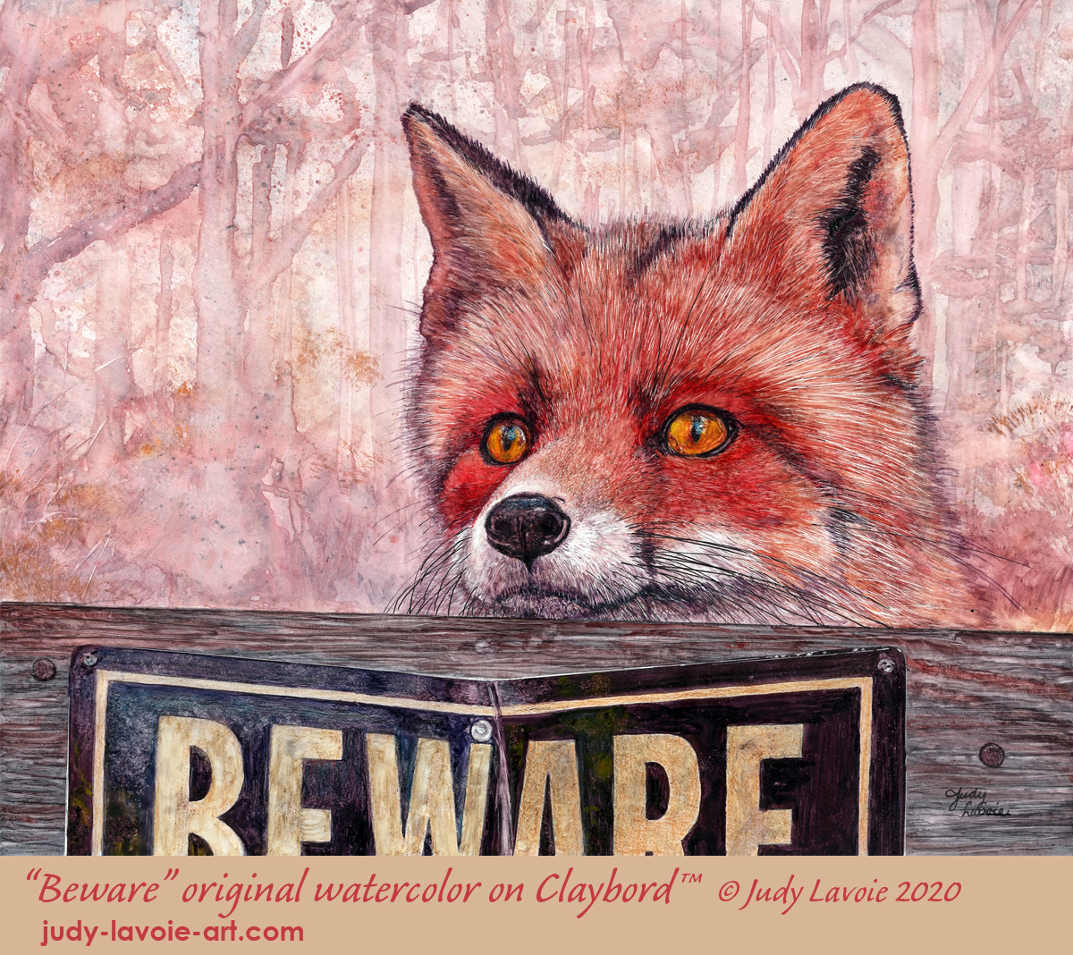
When we moved to our house in Tennessee, red foxes were among the abundance of wildlife we spotted in the surrounding woods. The red fox reference photo I found on Wildlife Reference Photos for Artists intrigued me, crying out to be painted!
I love doing animals on scratchboard, and the inquisitive fox pose was a perfect candidate. Initially I planned to use black #Ampersand #Scratchbord™, my recent focus. As my design concept developed I switched gears… watercolor on #Claybord™ became my media combination. I first used Claybord panels in the 1990s but haven’t used them in years. Claybord has a very slick surface of white clay and I generally prefer to paint on a textured surface, be it watercolor paper or the pebbly white clay-surface of an Aquabord™ panel. Time to bring it back!
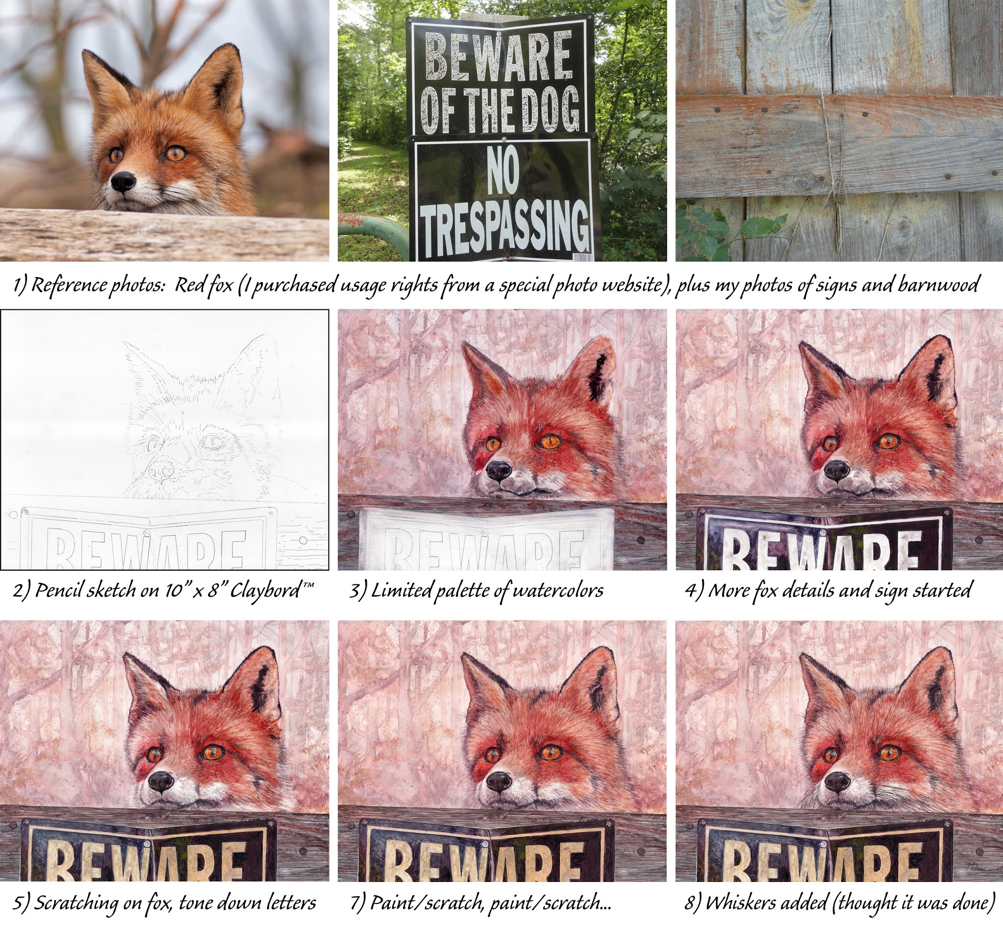
In the reference photo, the red fox peers over a wood board. Is he looking out or looking in? To add some interest to my painting, I decided a metal sign with lettering such as “No Trespassing” might work. While driving around I spotted a “Beware of the Dog” sign and it hit me as a better choice. I also loved the way the sign I saw was bent and worn, so I photographed it to add to my composition. If I just added the tops of the word “Beware” it would be enough to make it readable without distracting too much from my center of interest, Mr. Fox. The single word would add a little mystery too – beware of what?!?!
My photo collage shows how I combined the photos of the fox, the sign, and an old wood board with nails. I create my painting compositions digitally, using Photoshop (as I’ve used as a graphic artist for decades). The composition would work well on a horizontal 10″ x 8″ panel.
As I often do with watercolors, I chose to use a limited palette of colors. I used Golden QoR watercolors: yellow ochre, quinacridone gold deep, permanent alizarin crimson, venetian red and ultramarine blue. I knew this would give me natural hues and allow a wide range of tones by mixing two or three of these together.
After transferring my sketch to the clay surface I began the painting with the background. I admit to struggling with applying watercolor on the slick surface of the Claybord. In this case I concentrated on suggesting a wooded setting, painting vertical strokes and allowing my colors to blend somewhat randomly. I added a bit of spattering and sponging for more texture, then convinced myself to stop fiddling! (One upside to using Claybord is it is easy to ‘wipe the slate clean,’ simply by rewetting and lifting off the watercolor.) The result was a rather ‘painterly’ look which hopefully would accent the realism of the rest of the painting.
With white scratchboards I apply saturated color to areas I know I’ll be scratching through later, so the white scratches will show up in contrast as some color is removed. Analyzing my progress at Step 4 of my photos, I felt the white letters were too bold and I decided to tone them down with yellow tones. Fur is fun to depict on scratchboard by alternating making white scratches in the direction it grows, applying transparent color over the scratches, then scratching through those areas again. I used this layering process on the wood board in this painting as well, and it helps to add dimension to these surfaces. By Step 8 I had drawn the black whiskers with a Micron black fine line pen; I thought the artwork was finished and signed my name. But wait, there’s more….
A young woman named Krisztina who has purchased several of my paintings has become a good friend, even though we live far from each other. She is a talented artist (working primarily in enamels currently) and has a great eye, so she’s become valuable to me as an honest and insightful critic. I try to do the same for her artwork. When I emailed her the image shown in Step 8 she was very complimentary but said “One thing I would change .. his eyes… too red… same color as his fur… I would change it to more yellow/brown so it stands out more.” As I tried to look at my work as objectively as I could, I agreed. But I was leery of altering the eyes, but it was now or never since I’d next be applying a clear UV sealer. One property with Claybord, which can be a benefit or a deterrent, is that painting wet color over existing color can easily lift back to clean white clay. So I carefully created a golden tone with my watercolors, trying not to dilute with too much water, and touched my brush carefully to the fox’s eyes. It didn’t take 60 seconds to replace the red tones with yellows and the results were very subtle. But I thought it was an immediate improvement! My image at the top of this blog is the final painting. Thanks Krisztina!

For this painting I used one other unique Ampersand product, a #FloaterFrame. Unlike conventional frames, the floater mounts artwork from the back and there is nothing overlapping the edges of the painting. This truly gives it the appearance of floating within the frame box. I selected a FloaterFrame in natural maple and left it unfinished since the color beautifully accented my painting. These frames come with the necessary hardware and easy-to-assemble instructions. Voila, my finished fox.

For years I’ve made my Christmas cards from my own artwork, so “Beware” became the star this year, with a bit of alteration through the magic of Photoshop. Merry Christmas to you!