 I was ready to try a large watercolor portrait on white Aquabord™ and hunted through my reference photos for an inspiring subject. I had taken some photos of my 3 year old great-niece Emma a month earlier when we took her to a terrific children’s museum. She is cute, bubbly, and a happy little girl; she was excited and animated with the fun activities at the museum. I got some good photos of her but none of them jumped out for the painting I had in mind. I went back into my photo reference files to those taken during a visit with Emma and my nephew and his wife in Georgia one year earlier. I had taken many photos of Emma on her outdoor playhouse on a lovely fall afternoon. Among those was a shot I took as she reached the top of the ladder to the wood platform. The side lighting, intense expression, details of her fine hair, folds of her clothing, and wood textures all appealed to me. I was ready and excited to start a new painting from this shot.
To begin, I chose the largest Aquabord panel I had on hand, 18″ x 24″. As with previous portraits, I selected a palette of Golden QoR® watercolors, including 3 warm primaries, 3 cool primaries, and Sap Green to augment green background colors I’d mix from the primaries.
 I worked on this painting during the period between Christmas and New Years weekend, and had the rare pleasure of painting nearly every day for 9 days! As the photo collage shows, I established the facial features early on, re-adjusting them many times over as the painting progressed. I established the distant trees early, negatively painting some of the tree trunks on the right. Negative painting is easier on Aquabord than on watercolor paper, because it is simple to lift off color. See the difference from Step 3 to Step 4, where the light colored tree trunks have been creating by wiping off the areas where I had previously roughed in some greenery. I purposely made the background dark here, so there would be good contrast with the lighter side of her hair.
As I progressed with the painting I found the background on the left kept distracting my eye from my main subject, Emma. Here I wanted a light value since the strands of her hair on that side would be dark. You can see in Steps 6 and 7 how I softened that background area to make it less dominant. Technically, this was just a process of gently dabbing the dry paint with a lightly moistened paper towel to remove pigment and soften the hard edges. This was just the right “fix” to make the background less dominant, and the out-of-focus look contrasted well with the sharpness of her dark curls.
My colors obviously are not true to life – much brighter and bolder. The dress was easier to paint as pink rather than its true peachy tone, since I could simply vary mixtures of one of my selected paints, Quinacridone Magenta. On the skin and fabric, I paid close attention to highlights and shadows, which are the key to creating three-dimensionality. Yellow tones make the highlighted areas of skin burst to life, so I up’d the yellow, particularly on the face.
When working on Aquabord, painting wet over dry areas can easily lift the existing colors off the surface. To add one color over another the best results are possible by diluting the pigment to the proper tint so that one stroke will add just the right amount of additional color. This will minimize brushing continuous strokes of wet paint over the dry paint on the surface. A relatively light load of paint on the brush (a dry brush, as it is called) and short strokes work best versus a broad wet wash you might use as a glaze on watercolor paper. I put extra effort into smoothing the color transitions on Emma’s face, neck and arms, since a child’s skin is so soft. It takes a bit of adjustment to master the unique characteristics of painting on Aquabord in comparison to on cold-press watercolor paper, and I fine tune my techniques on Aquabord with each painting.
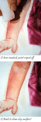 The close-up of Emma’s right arm shows how I lifted color off the clay surface nearly down to the original white. I had painted the skin colors beyond the pencil lines which outlined her arm, just to do it fast without being too fussy. Between the arm and dress I ultimately wanted the surface to be clean so the painted background would be consistent. I laid some masking tape along the inner edge of the arm and wiped away the excess paint with a small slightly dampened wedge I cut from a Magic Eraser. Voila, a nice sharp clean edge!
I did a lot of work between Steps 7 and 8 – I was so involved with the creation process that I forgot to stop to take more photos… sorry! I love painting wood textures and the structure helped to frame Emma’s face, with the perspective of the foreground boards leading the viewer’s eye inward. The dried leaves on the platform, her little finger in shadow between the boards, and the embroidery on her bodice are the type of little details I love to include to add character to a painting.
My final step was to do some scratching into the white clay surface, creating the brightly lit strands of hair on the right, the lovely little curls catching light over her forehead, and the highlights in her eyes. I’ve learned that scratching the Aquabord surface is not really a conventional way the product is designed for, but it is one of its characteristics which I love most! I can create fine details which would be much more difficult, if not impossible, on a paper surface versus on the rigid Aquabord panel. Fine scratches made with an x-acto knife revealed the white clay surface below painted sections of the panel, perfectly depicting the wispy hair lit by the sunshine. The close up photos of the face show my progress.

All of the watercolor competitions I’ve entered restrict the surface to watercolor papers. I had hoped this painting would be accepted in a national watercolor competition after discovering that Aquabord was permitted, so I entered. My second submission (Sorghum Maker), a watercolor portrait on paper, was the one which the juror chose. I’m delighted and proud to be included in the 2020 Georgia Watercolor Society National Show.
