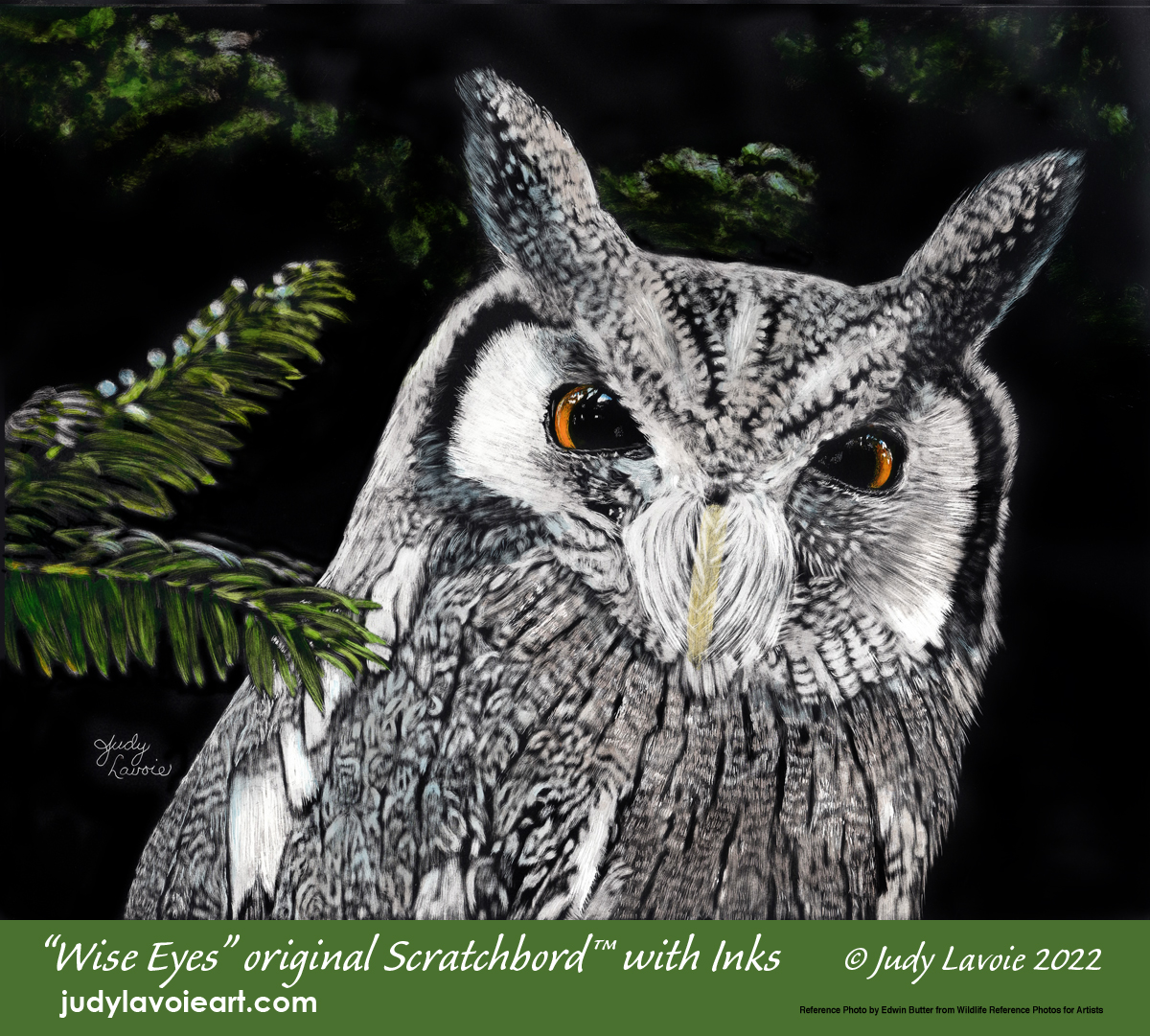
"The art of being wise is the art of knowing what to overlook." - William James
I liked the above quote and it inspired the title for my newest painting "Wise Eyes." Unintentionally, it seems I am in a ‘bird’ phase. My three most recent scratchboard paintings have been a black swan, a brown pelican, and this northern whitefaced owl. Feathers can be beautifully rendered on black scratchboards, as can fur and other textures. I recently taught a class on beginner scratchboarding and one of the images I presented as a choice for a project in class was an owl’s face, a subject I had never done. My students' results were terrific, so I decided it was time for me to tackle an owl on scratchboard too!
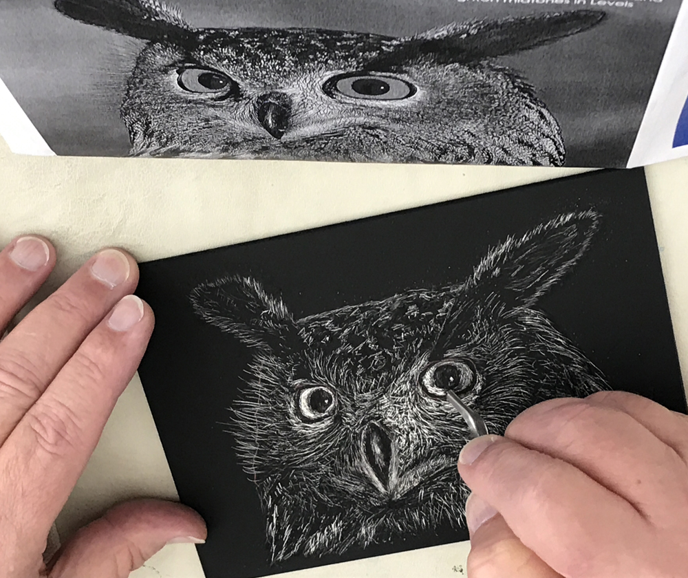
My beginner student's terrific progress on a scratchboard owl
My reference photo came from Wildlife Reference Photos for Artists, taken by a photographer from Amsterdam named Edwin Butter. When I emailed my art to him, he said “I hadn't heard of scratchboard art before. It produces a beautiful effect!” He said he had photographed the Northern Whitefaced Owl (Ptilopsis Leucotis) at ARTIS, the zoo in Amsterdam, where he is a volunteer photographer. His photographs are amazing! I love making connections like this through my art.
I decided to create a horizontal image of the owl, on a 10” x 8” Ampersand Scratchbord™ panel. I cropped the photo image to focus on the face, with a bit of the background foliage visible. His orange eyes are captivating, so I planned to add color to this scratchboard painting.
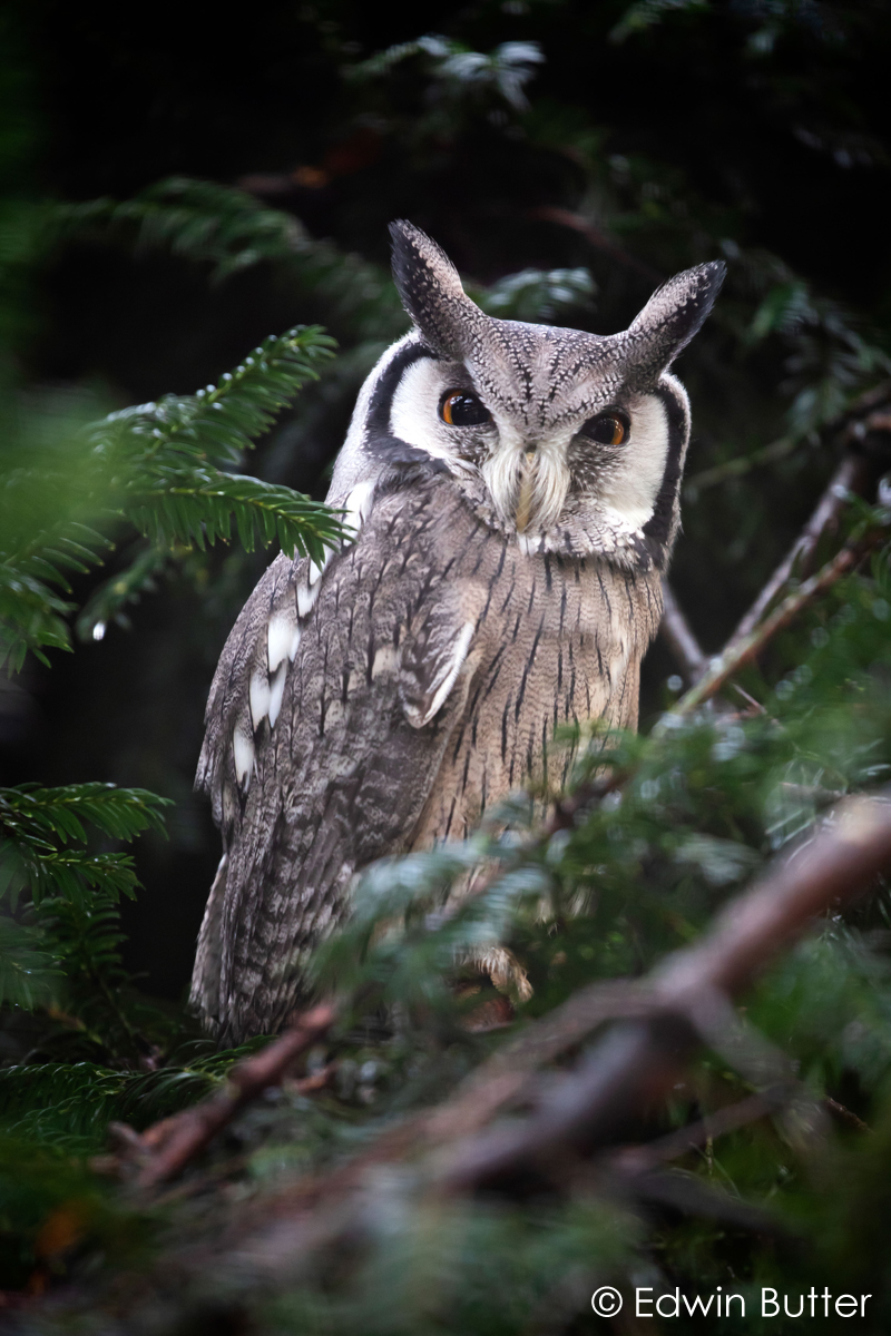
My reference photo © Edwin Butter
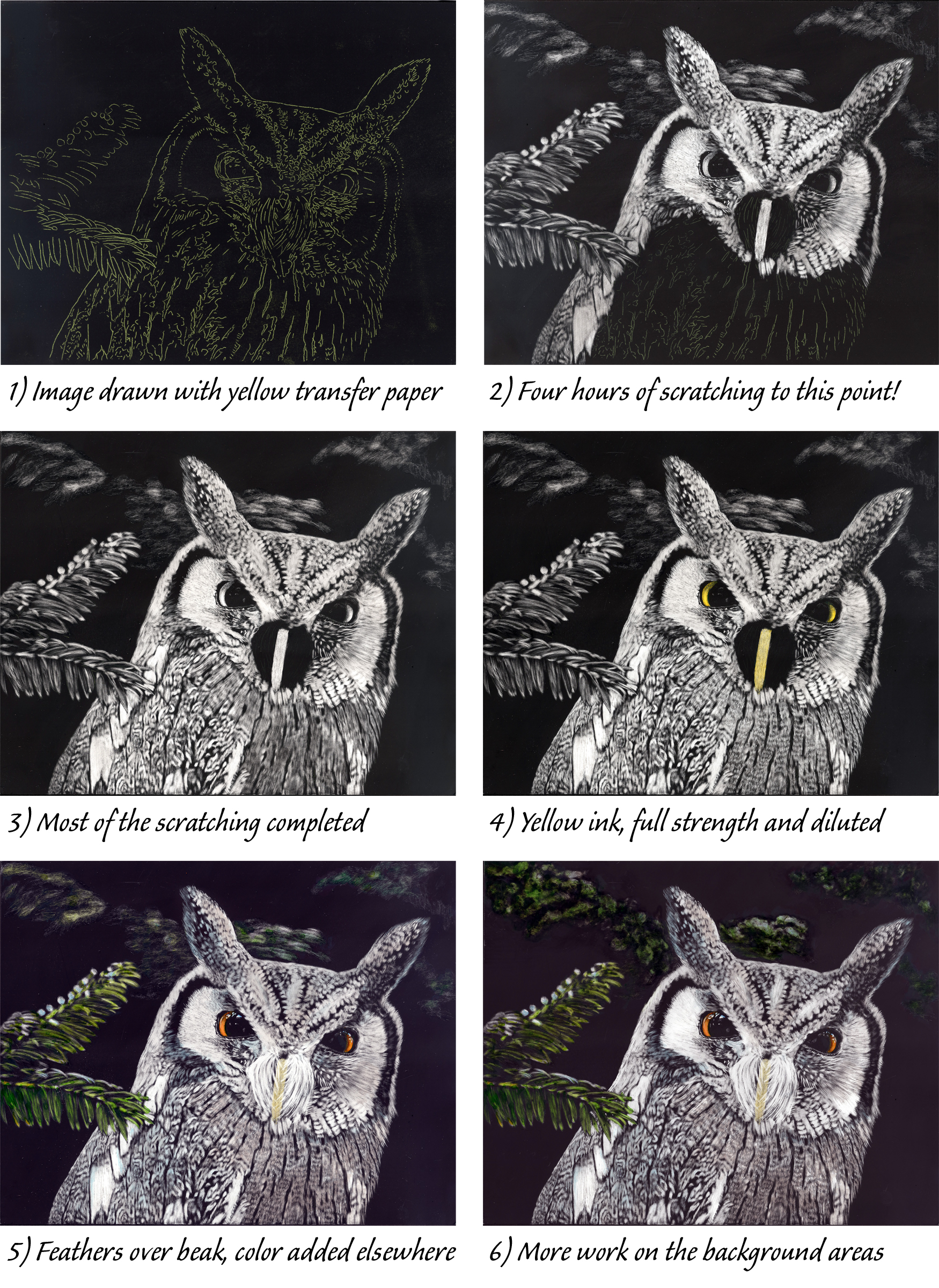
Using yellow Saral Transfer Paper, I traced the major value contours onto my black panel. My scratching tools were a multi-needle tattoo tool, a thin fiberglass brush, and an x-acto knife.
I was intrigued by the way the owl’s feathers grew over his beak. The best way I could figure to achieve this effect was to scratch the beak area first, color it, then scratch the feathers over it. With hours of scratching completed, as shown in Photo 3, I took out my Claybord/Scratchbord inks. This set comes with 6 colors (blue, red, yellow, green, sepia, and repair black), so other colors can be mixed. The inks are very transparent, and they will not conceal the black unscratched surface as they color the white scratched areas.
As a watercolorist, I know that an initial layer of yellow can add vibrancy to any area which will be painted with a color containing yellow, so I used undiluted yellow as a base coat for the owl’s colored pupils. These inks are water-soluble and have shellac as a component; I find they can lift off the smooth surface if I add more ink where the first coat is still wet. My best procedure for painting these inks on my scratchboard is to dilute or mix my colors in a small cup (it takes just a drop at a time) and test the color on a piece of white watercolor paper until I am happy with the shade. Then I try to apply in color in one coat. I let this dry completely before adding another layer of color in the same place (Note: always let an inked area dry before doing any additional scratching over the color). This is how I did the pupils, mixing a bright orange to layer over the dried yellow coat. For the beak, I diluted yellow ink a bit and added a touch of sepia. I made the yellow shade bolder than it looked in the reference photo, aiming to keep it visible when the white feathers covered it.
The green ink in the set is rather bright, so I used it undiluted for the brightest tips of the tree needles and added blue and a touch of black to darken it for the rest of the greenery. I used a dilution of blue plus black over some of the scratched feathers and on the white tips of the foliage, and used diluted sepia in other feather areas. In the big pupils of the eye I scratched highlights, which adds so much life to the critter! At the top of his pupils I put bright blue in the highlights. Photo 5 shows my progress to this point.
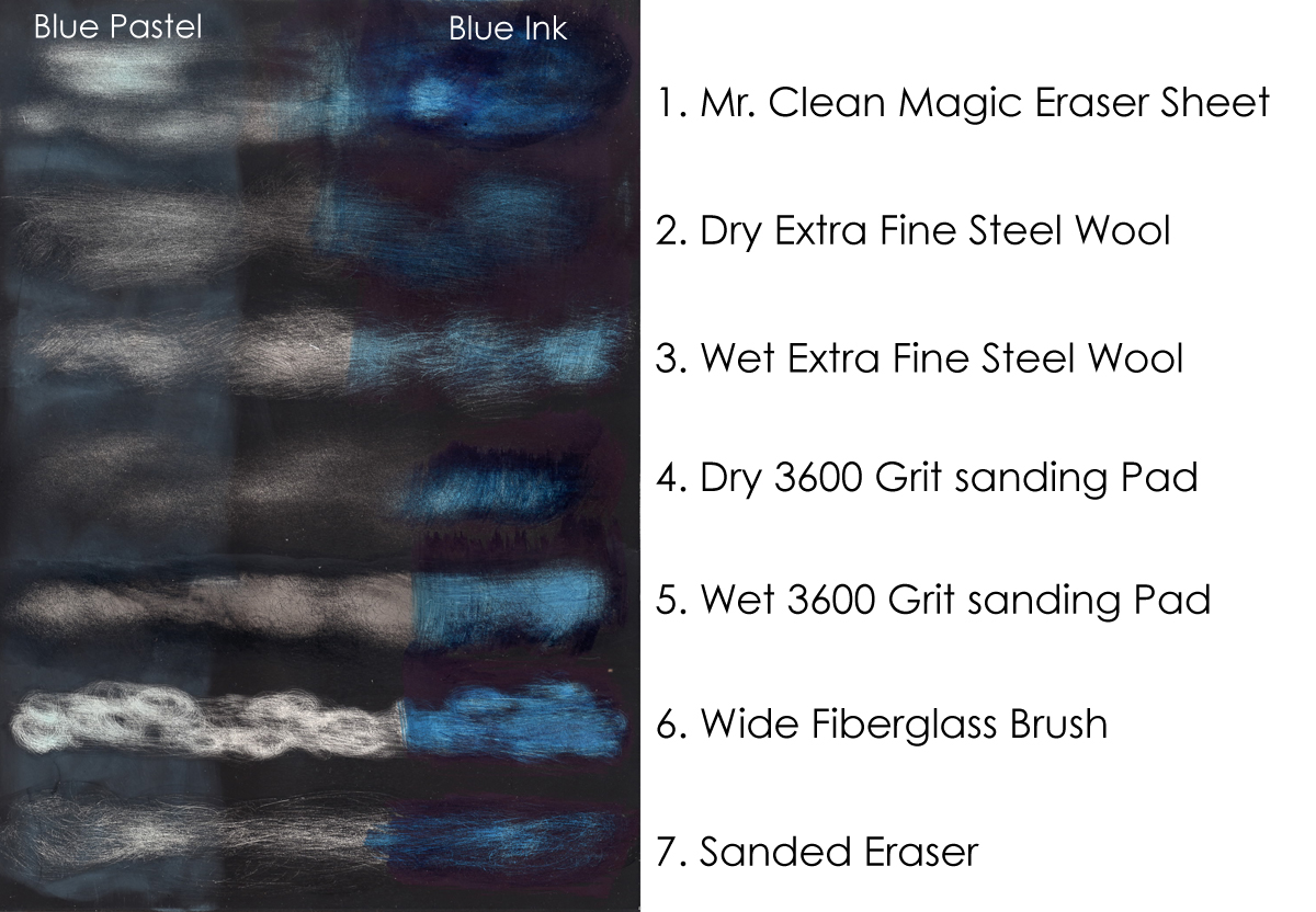
I struggle with scratching techniques to create the appearance of a fuzzy, out of focus background. I wasn’t happy with the background of my painting, so I created the test panel shown here. I liked the wide fiber brush effect best, so I ended up using my thin fiberglass brush in circular motions. Then I carefully swabbed the same areas with a Q-tip dipped in straight rubbing alcohol and blotted before also rubbing in circular motions on the scratchboard surface. The black india ink of the Scratchbord surface dissolves with alcohol, so this helped soften the marks. Satisfied with the effect I achieved, I painted the background areas above the owl’s head with more mixed green ink. If you look closely at Photo 6 you might see that the green ink overlaps some of the black surface around my soft scratches in these areas. One of the unique qualities Ampersand manufactured into their inks is that this over-painting will magically disappear when a clear varnish is applied to the finished artwork. This is one of many reasons I choose these inks over transparent watercolors or other media.
"Wise Eyes" will grace my Christmas card this year and also be featured on December 2023 in my art calendar. (Watch for a post about my calendar soon!)