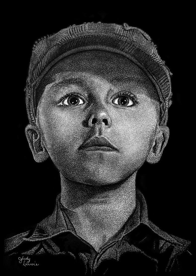
Remember the scratchboard "Wee Lad" I last posted about? Well, I messed it all up! Here's what happened....
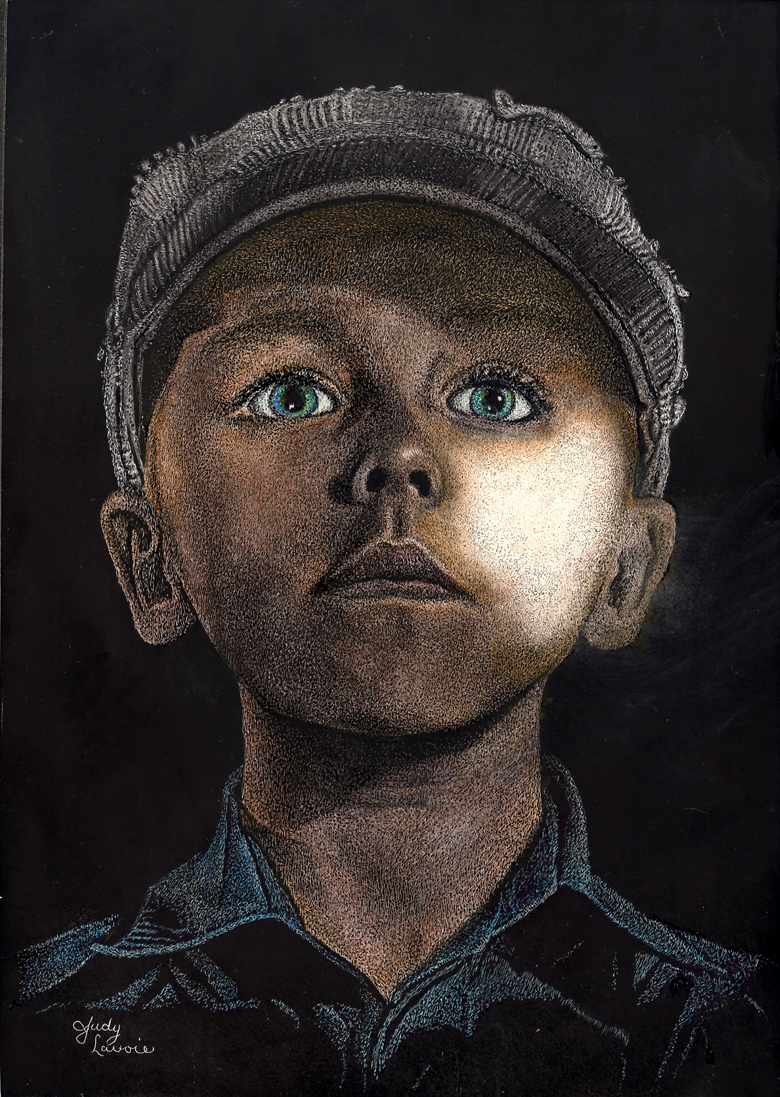
I considered this a learning piece, so I decided to continue beyond the black and white stage and add some color. Since I was imagining the little boy as a Scottish lad, I thought it would add to the look to give him blue/green irises. I stratched away a bit more in his eyes to allow the color to show better and painted them with mixed watercolor hues. I loved it. Then I thought it might be cool to add skin color and a touch of blue to his shirt, sort of like old photos were hand tinted. It's appropriate to quote a translated line of poetry from Scottish National Bard Robert Burns here: "...best laid plans of mice and men often go awry...."
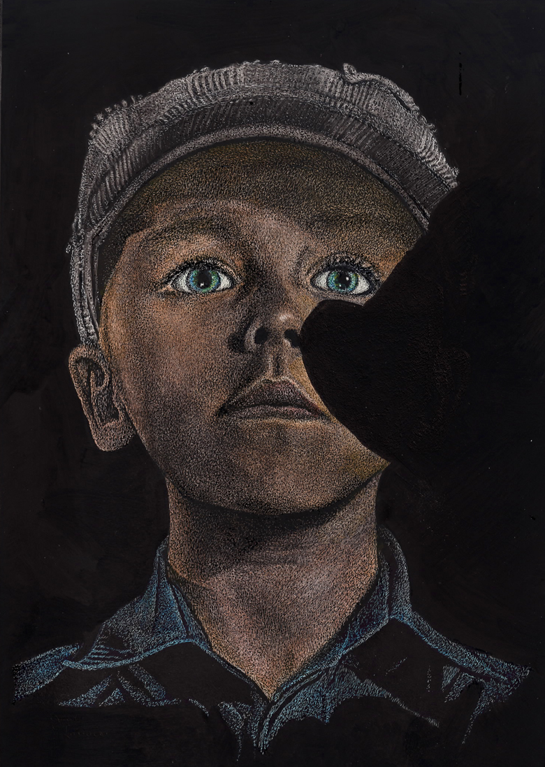
Yes, things began to go wrong. As I applied a skin tone mixed from watercolors, one of the boy's checks took the color in a very irregular way and it made his skin look blotchy. Painting more color didn't fix it, nor did stippling dots with a fine black pen (the technique I used on the original artwork). I tried to re-wet the watercolor and lift it off, which is one advantage of using water soluable pigments to color scratchboards. As I rinsed away the color, some of my black stippling also came off, leaving an area of about 1/4" very stark white. I am still not sure why this happened. Perhaps the Micron permanent pigment pen I used for black stippling dissolved? (My Copic pen, the tool recommended by my workshop instructor Sheryl Unwin who taught me this stippling technique, had not yet arrived). Was my watercolor paint applied too wet? Did I rub too hard to lift off the color? Maybe some of what had looked like stipple texture on his cheek was black residue, scratched from the surface then embedded in the white clay, which dissolved and lifted? All I knew is that I wasn't able to repair the damage by re-painting, re-stippling and/or re-scratching. So I cleaned all around the area of the boy's cheek which was most effected. I purposely removed the watercolor and the black stippling by rewetting and blotting, leaving a big white void. I was really disappointed, wishing I had left the black and white art as it was. I was determined to rescue all my hard work and find a "fix" for this painting. Fortunately I had scanned the scratchboard before I did any coloring, so I can still make reproductions of the black and white version!
I considered a few options:
- Saw off the right section of the panel
- Find something to paint over the bad area
Cutting off the right half of the scratchboard would also cut out a lot of the painting which I still liked, so that idea was quickly discarded. Since the boy had a vintage look, I tried to come up with something I could add to his portrait which would keep with the theme but mostly just cover his upper cheek. Maybe I could make him look like he was partly hidden behind an old brick wall? No, a straight wall would cover up too much of him. He looked like a newsboy, so perhaps I could add a corner of a paper he was carrying with a hint of an old headline, like the sinking of the Titanic. I could position the folded paper so it angled in from the right, covering the side of his face below the eye. But it might be hard to make the light value of the newsprint paper smooth or to do black lettering on the white background of the newspaper. So I vetoed the newsboy idea too.
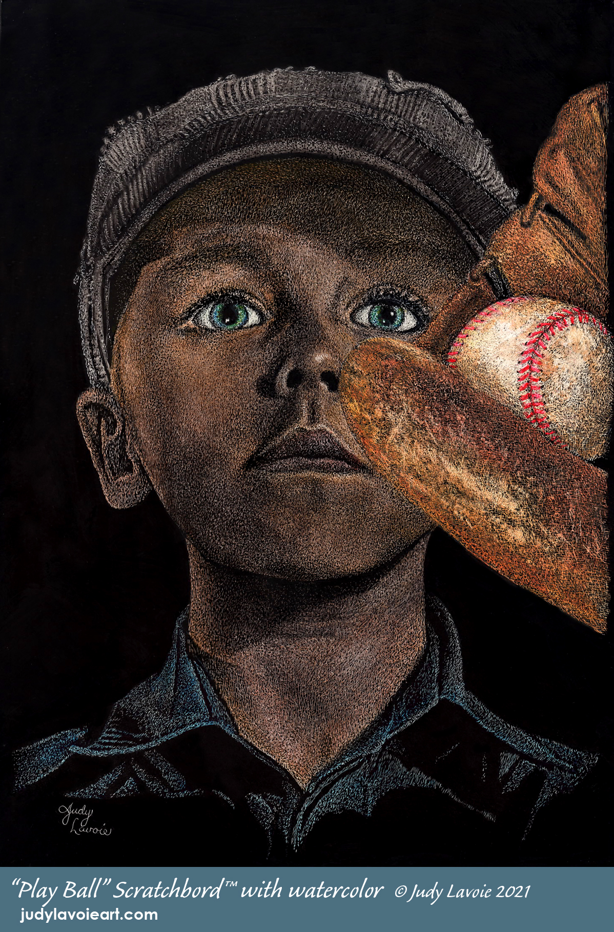
Then I woke with a thought in the middle of the night (I labor over these painting dilemmas!) I could add a baseball mitt as if it was on his left hand, raised up and turned to just overlap the cheek. The aged worn leather and a dingy old ball would add to the retro feel. This might just work.
Click any image view Judy’s stippling steps larger…

To do my fix, I first resorted to Ampersand's "Black Repair" india ink, which is sold as part of their 6-bottle Claybord Scratchbord Ink Set. It matches the black coating on manufactured Scratchbord™ panels. I sketched out the baseball mitt and ball, sized in proportion to the face. I cut the outline of the mitt shape to lay over my art, turning it to cover the damaged area. This was going to work and I was delighted! The biggest question I still had was whether I'd be able to scratch the mitt where I had already done so much scratching on his face and have the same results as scratching the mitt where it would fall on the untouched black background area. Time would tell.
The Black Repair went on beautifully and I even painted it over my signature and touched up other marks in the black background. Next I transferred the mitt and ball image using graphite transfer paper. The lines it makes on the scratchboard are dark, but visible when the panel is angled a certain way toward the light... enough to guide my scratching.
Little by little, the mitt and ball came to life. My worries about the previously scratched surface areas were discarded; the major difference in scratching there versus on the virgin surface was a slight feeling of drag on my scratching too. The visual appearance seemed to be the same in each area. Hoorah!
I had grown a little paranoid about lifting the black when it came time to add color to the mitt and ball. I tried to control my stippling of these additions carefully, so I could minimize adding black dots with the pigment pen... to avoid a repeat disaster! The leather and the ball surfaces needed to be rough and irregular to show age and usage, so I wasn't required to do the same smooth textures which the face had required. Once I had the new items stippled to coordinate with the Wee Lad, I mixed up watercolor pigments and added some color - very carefully this time, using more of a 'dry brush' technique than before. It was fun to add the red lacings on the ball - really made it look alive.
I am satisfied with how the old mitt and ball look and I think this helped recover my art. I never would have tried scratching that subject if I didn't encounter this problem. The final composite is a bit off-balance and not how I would have designed this image if I set out to paint a boy and a baseball mitt... but that's not likely a topic I would have painted. Under different conditions I might think of a way to add some other element on the left to balance the mitt, but I didn't want to mess things up again. Not to mention the hours and hours I have labored over this piece. Anyway, I saved the painting and have grown very attached to it.
I've learned from other artists to call experiences like this Happy Accidents - problems which you don't expect but whose resolutions create something as good or better and take you where you might not have ventured. I've re-named this painting and signed it; it is born again as "Play Ball."